Canadian Tire
Homepage, Product Details Page & Navigation
Going beyond MVP by introducing impactful new features and enhancements driven by research.
About this project
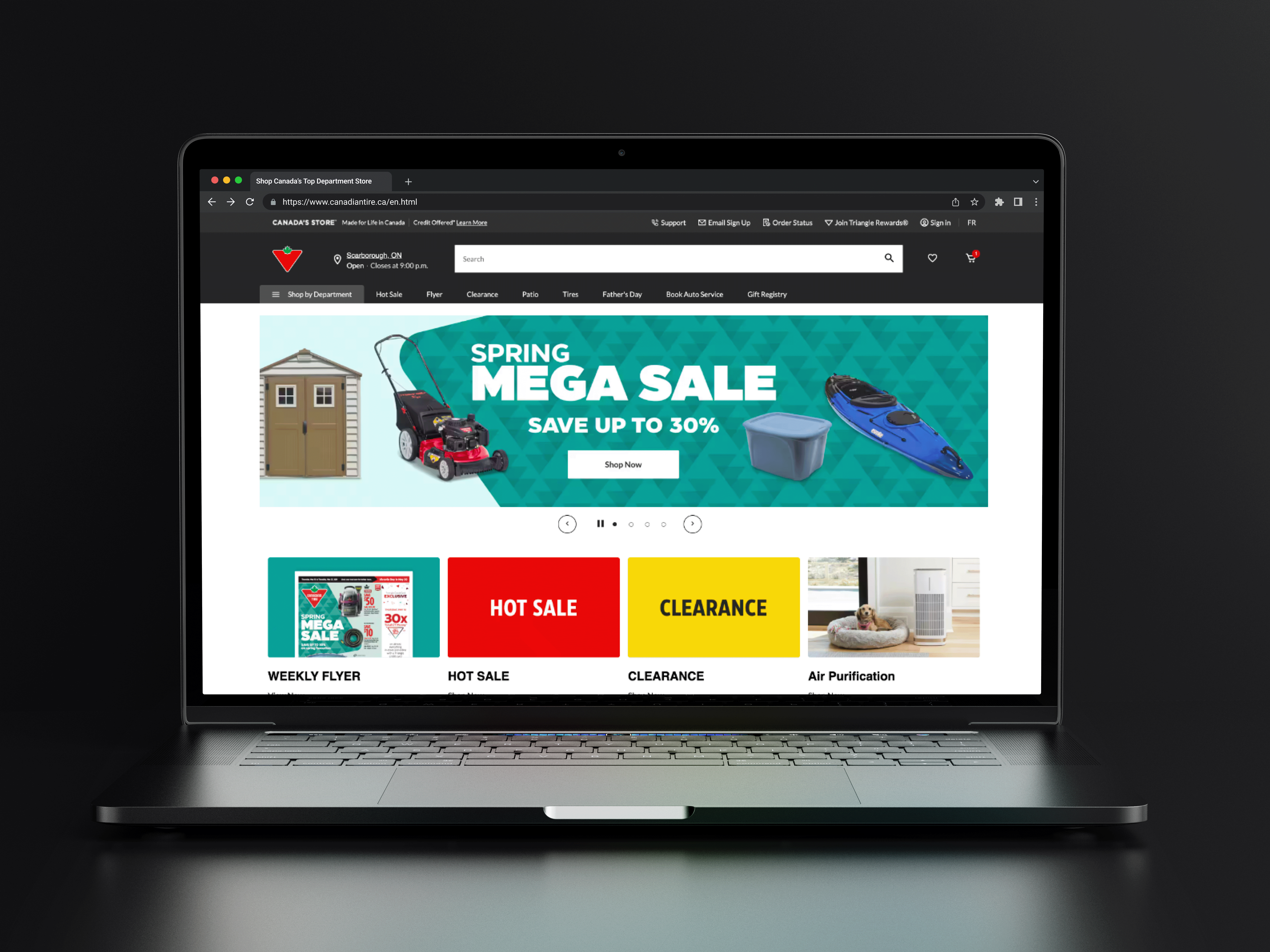
Canadian Tire, a household name and Canada's #1 retail brand, stands as a testament to enduring excellence in the retail landscape. Along their journey to transform it's online presence, I was responsible for leading UX efforts for the Homepage, Navigation, Product Details Page, Store locator and Navigational functionalities.
Challenge
While piloting the newly re-designed website, initial metrics revealed concerning trends, including a decline in product page revenue, click-through rates, and increasing bounce rates. Qualitative feedback echoed these concerns, with users expressing a preference for the previous site layout. Addressing these challenges became imperative, underscoring the need for strategic intervention.
Client
Canadian Tire Corporation
Role
UX Designer
Disciplines
Responsive Web Design
Interaction Design
UX Research
Inclusive Design
Design Systems
Handoff & Documentation
Creating an impact through design
Adoption
My designs were inherited by several brands under the corporation’s banner.
Expansion
Provided guidelines and documentation for the growing ODP design system.
Performance
We increased conversion rate by 0.18% which equated to $565K in revenue.
DISCOVER
A significant milestone met with new challenges and opportunities
Piloting a new experience
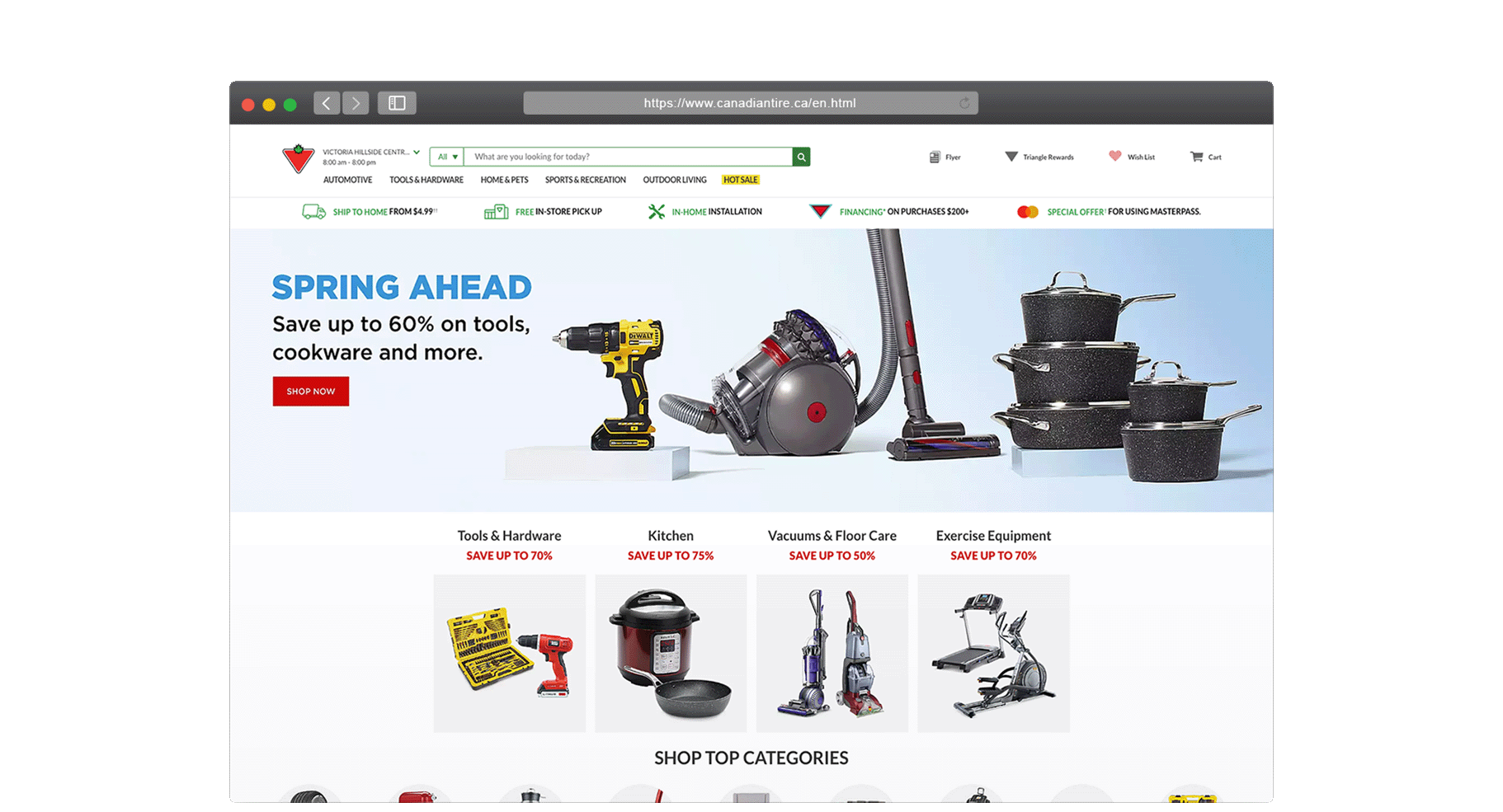
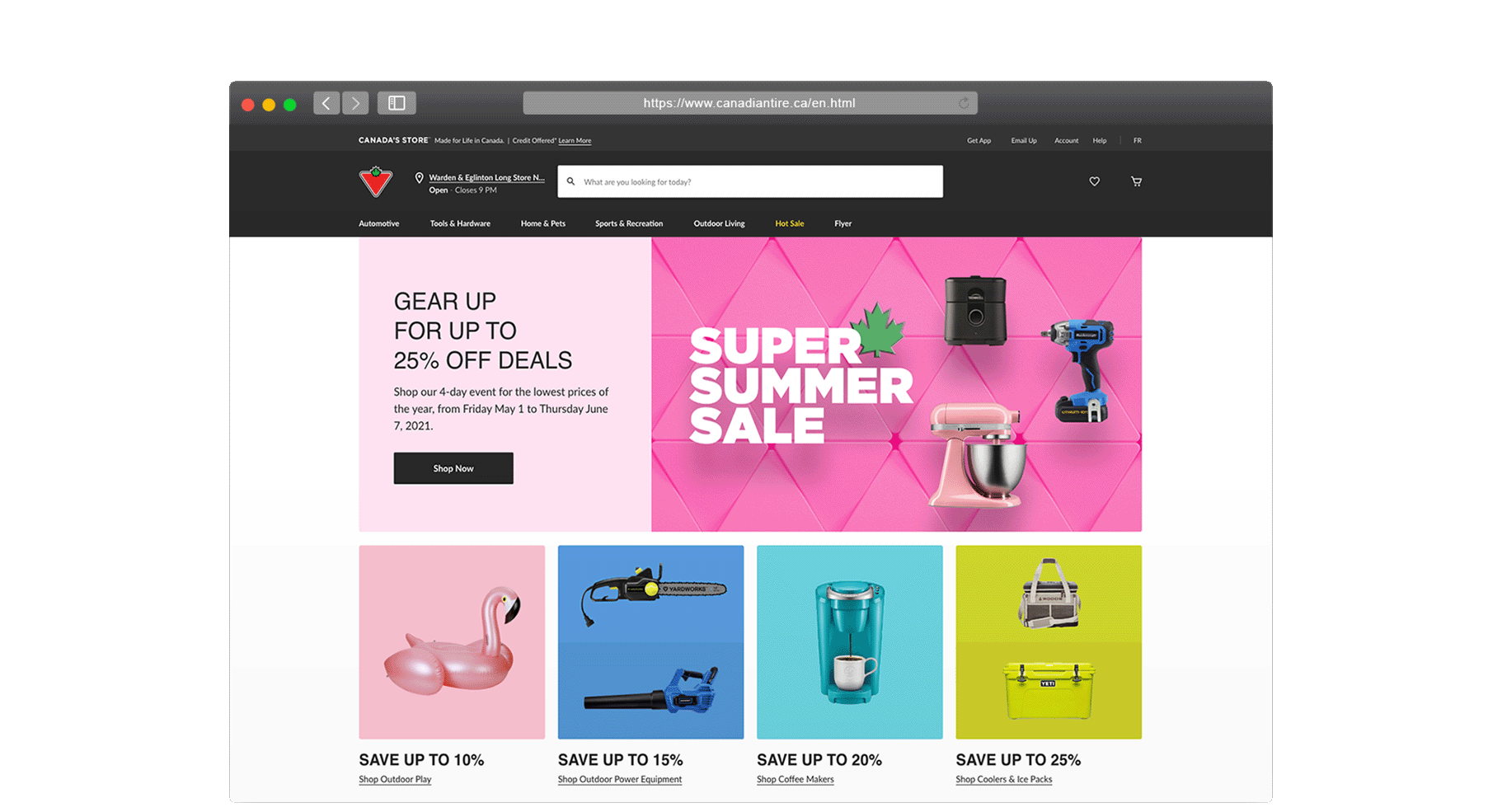
Kicking things off, our team at Canadian Tire embarked on a transformative journey by piloting a re-design on it’s retail website.
Signs of a slow start
Quantitative data provided by our analytics team revealed initial downward trends. The following metrics came from A/B testing the pilot vs. old site.


Establishing a research plan
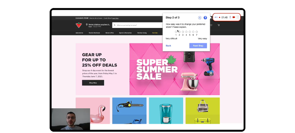
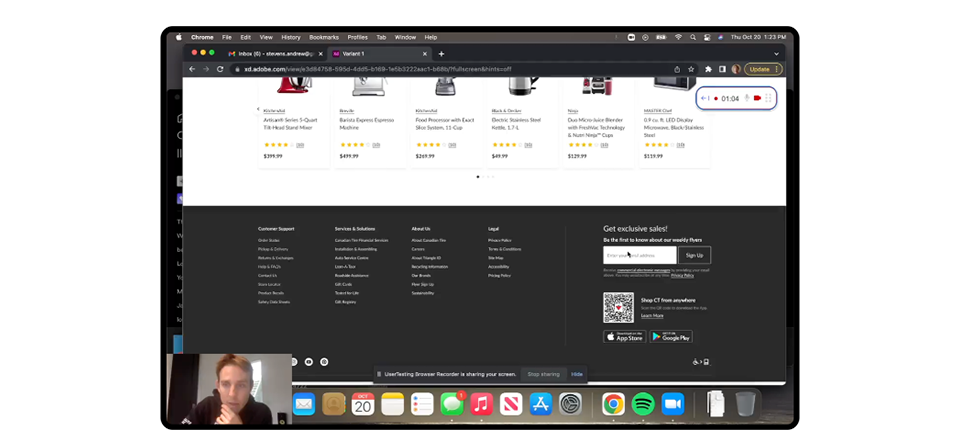
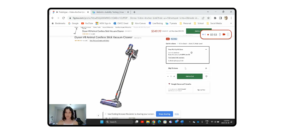
Eager to understand how shoppers felt about the new experience, our research team developed a test plan to capture customer sentiment and expectations.


Testing with Canadians nationwide
We conducted over 12 tests, totalling 173 participants.
What we learned from our shoppers
Positive reception on new look
The new site felt modern and elegant, offering a more visually appealing experience compared to the old site.
New site was not easier to use
Only 44% of participants found the new site easier to use, citing confusion with new features and layout.
Slow and not mobile-friendly
Slow load times and responsive issues were causing frustration, leading to a perception of decreased reliability.
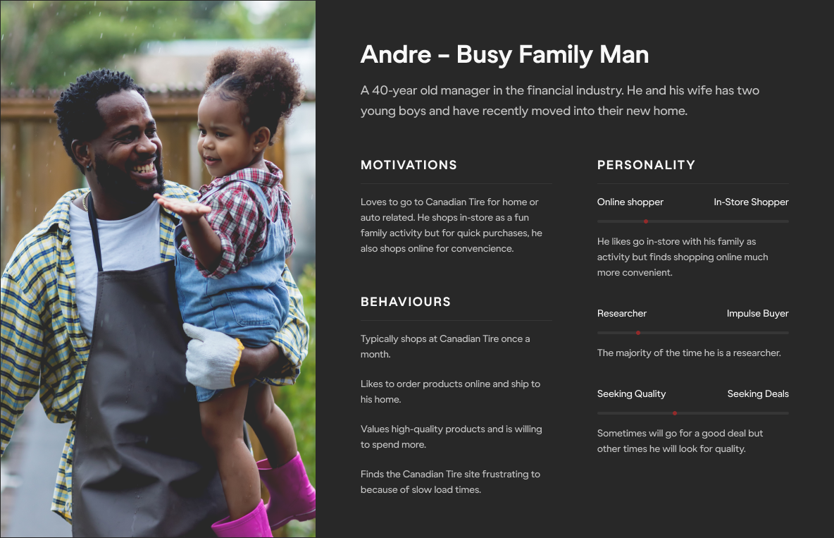
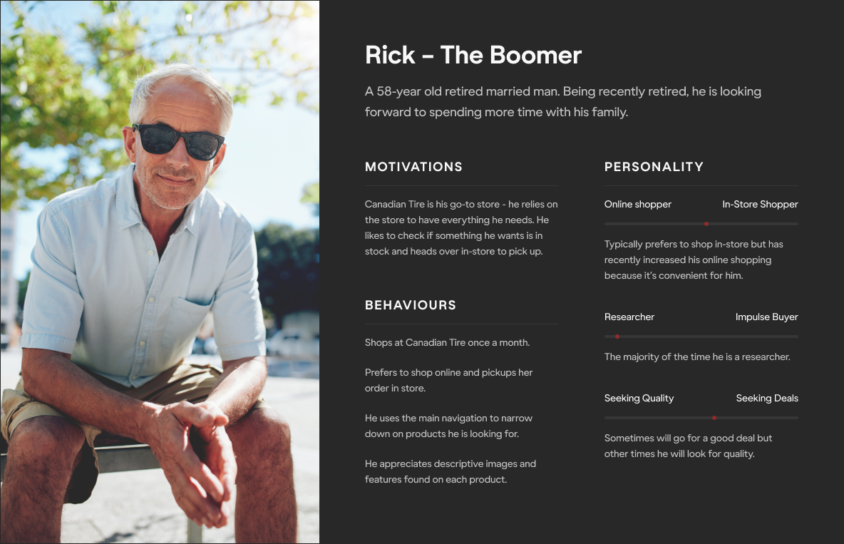
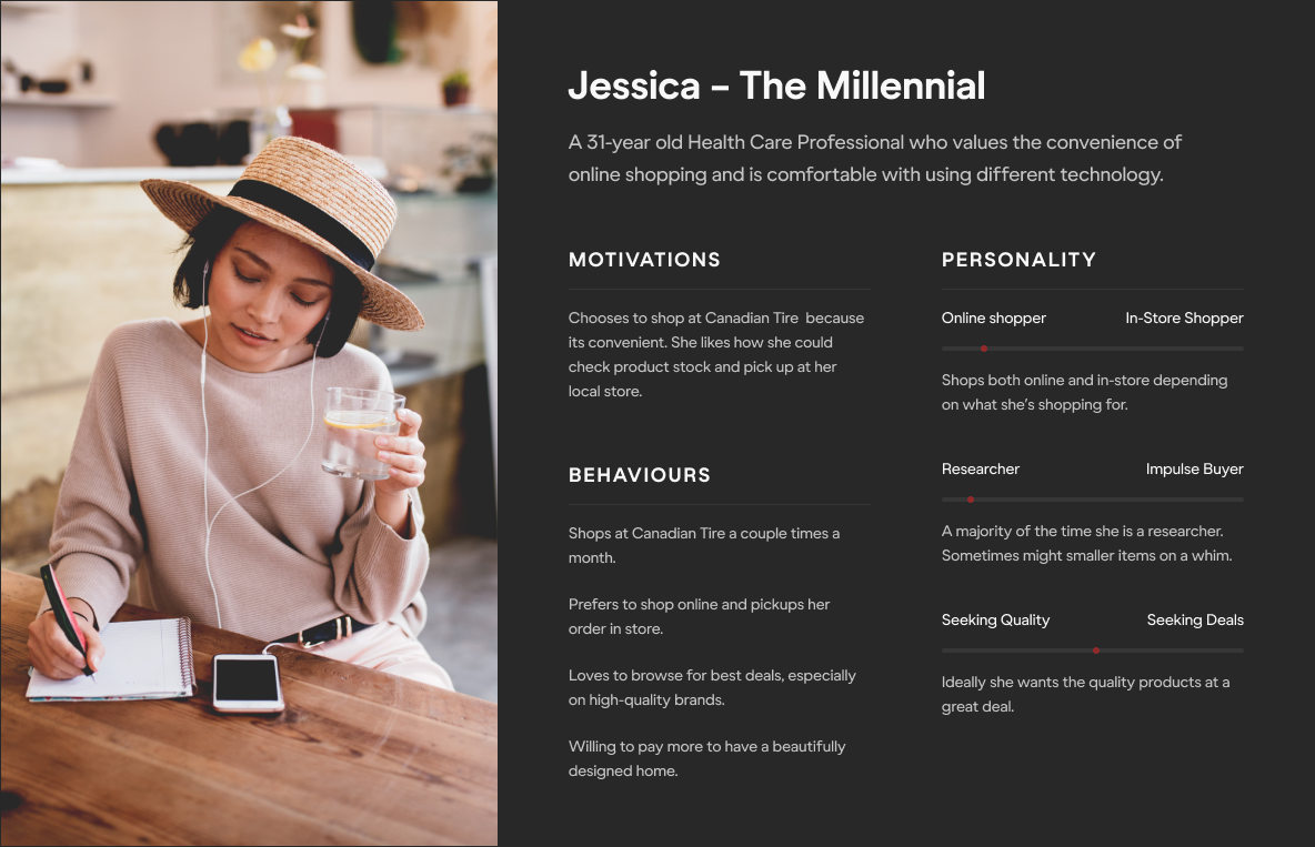
Refreshing our personas
Personas were updated to better reflect the needs and behaviours of our customers.
DEFINE
Pinpointing and addressing our UX shortcomings
Auditing for a deeper understanding
Building on top of our user research, a site-wide UX audit was conducted based on Baymard Institute’s structured e-commerce usability testing and benchmarking.
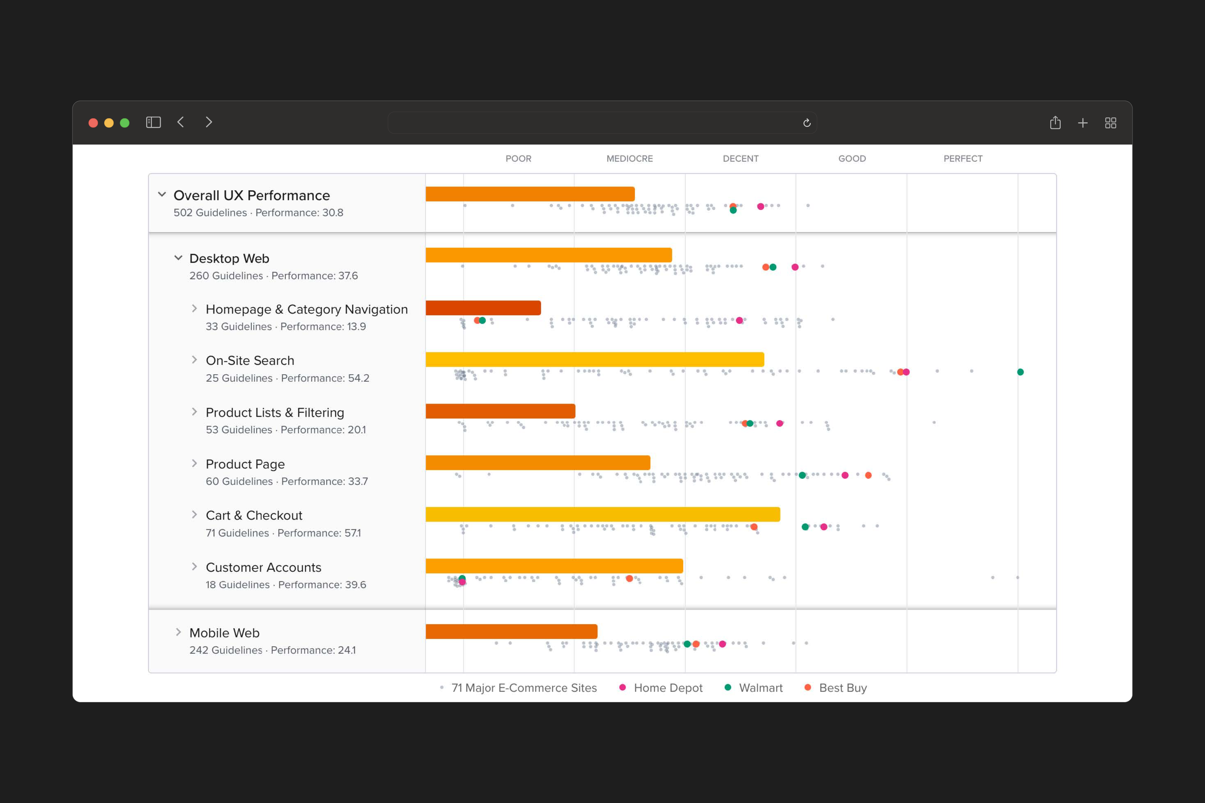
The pilot scored a "mediocre" UX performance
We identified the following areas of focus that required our immediate attention.
01
Visual Prominence
Key information was difficult to locate and easily missed, causing friction when making a purchase decision.
02
Page Layout
Pages were packed with distracting content and clutter resulting in excessive scroll times and cognitive overload.
03
Product Finding
Navigation lacked guidance and clearly defined categories, negatively impacting the browsing experience.
04
Accessibility
60% of our website was inaccessible, highlighting the need for implimenting inclusive design practices.
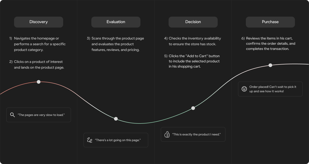
Mapping the customer journey
Aggregating insights gathered from user interviews and competitive benchmarking, we mapped customer emotions and pain points throughout the user journey.
Defining questions that drive us
Next, we defined our key questions to create a shared focus for our team, guiding our design process, discussions, technical discovery, and prototyping efforts.
How might we create a shopping experience...


DESIGN
Exploring and refining ideas for a better customer experience
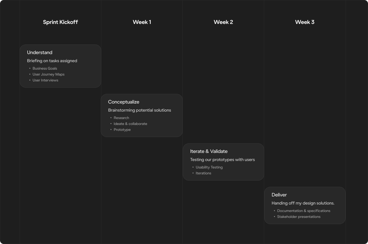
Embracing agile delivery
Delivering designs in an agile enviorment allowed us to work iteratively and incorporate user feedback in manageable sprints.
Ideation driven by collaboration
Bringing together diverse perspectives from cross-functional team members to help spark ideas during ideation.

Product Owner
Aligning to business goals.

Peer Reviews
Share-outs & brainstorming.

Design System
Maintaining brand integrity.

Research Team
Usability testing & feedback.

Engineering Team
Ensuring technical feasibility.

Accessibility
Adhering to A11Y guidelines.
Prioritizing inclusivity
Our commitment to delivering accessible experiences that resonate guided every decision we made. Prioritizing inclusivity allowed us to ensure our platform is able to serve our diverse audience.
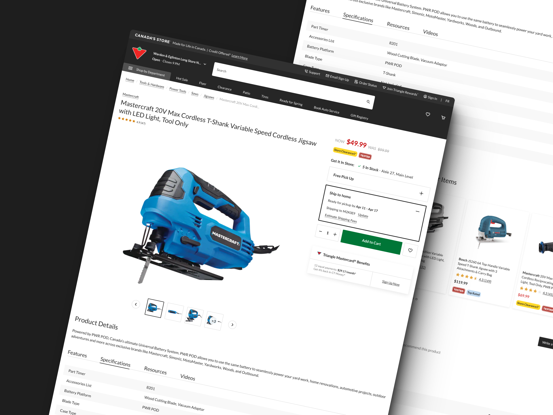
Optimizing viewport and content hierarchy
By streamlining page layout and emphasizing key information, we reduced visual noise and improved scannability resulting in increased user engagement.
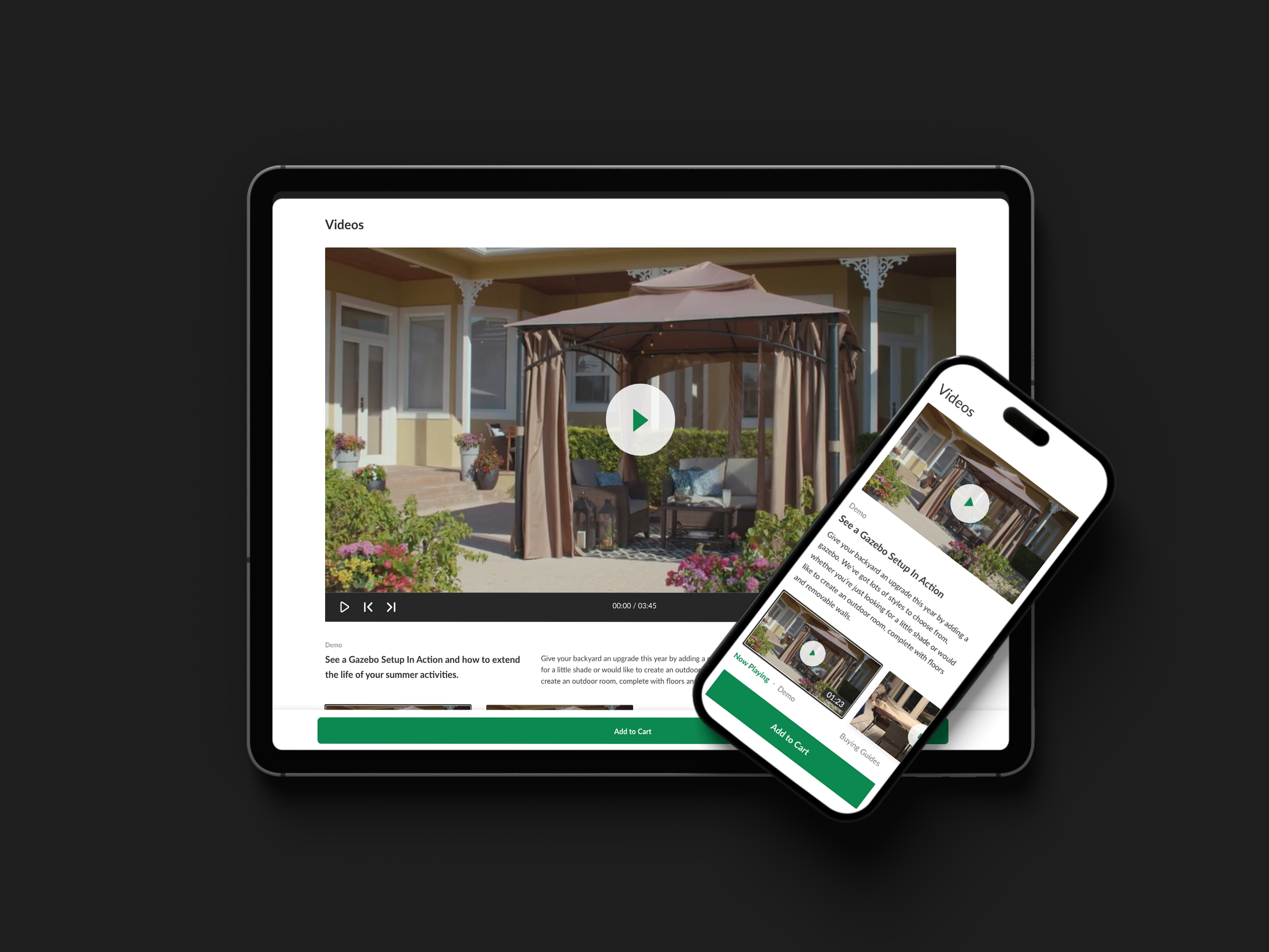
Bringing responsiveness across all devices
With over 50% of our visitors coming from mobile devices, we ensured our platform was able to deliver a seamless experience across all devices types.
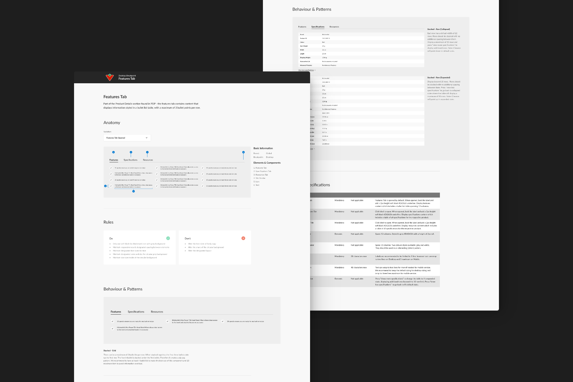
Hand off process
Ensuring a smooth handoff was crucial to my process. Design decisions, user research insights, specifications and assets were documented to ensure our developmers had everything needed for implementation.
LAUNCH
Unveiling our enhanced experience for our 33 million monthly shoppers
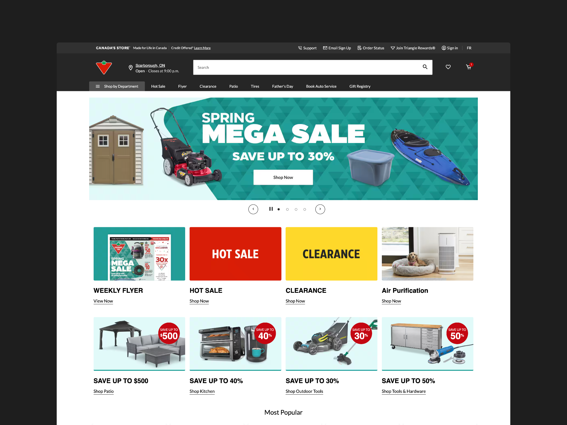
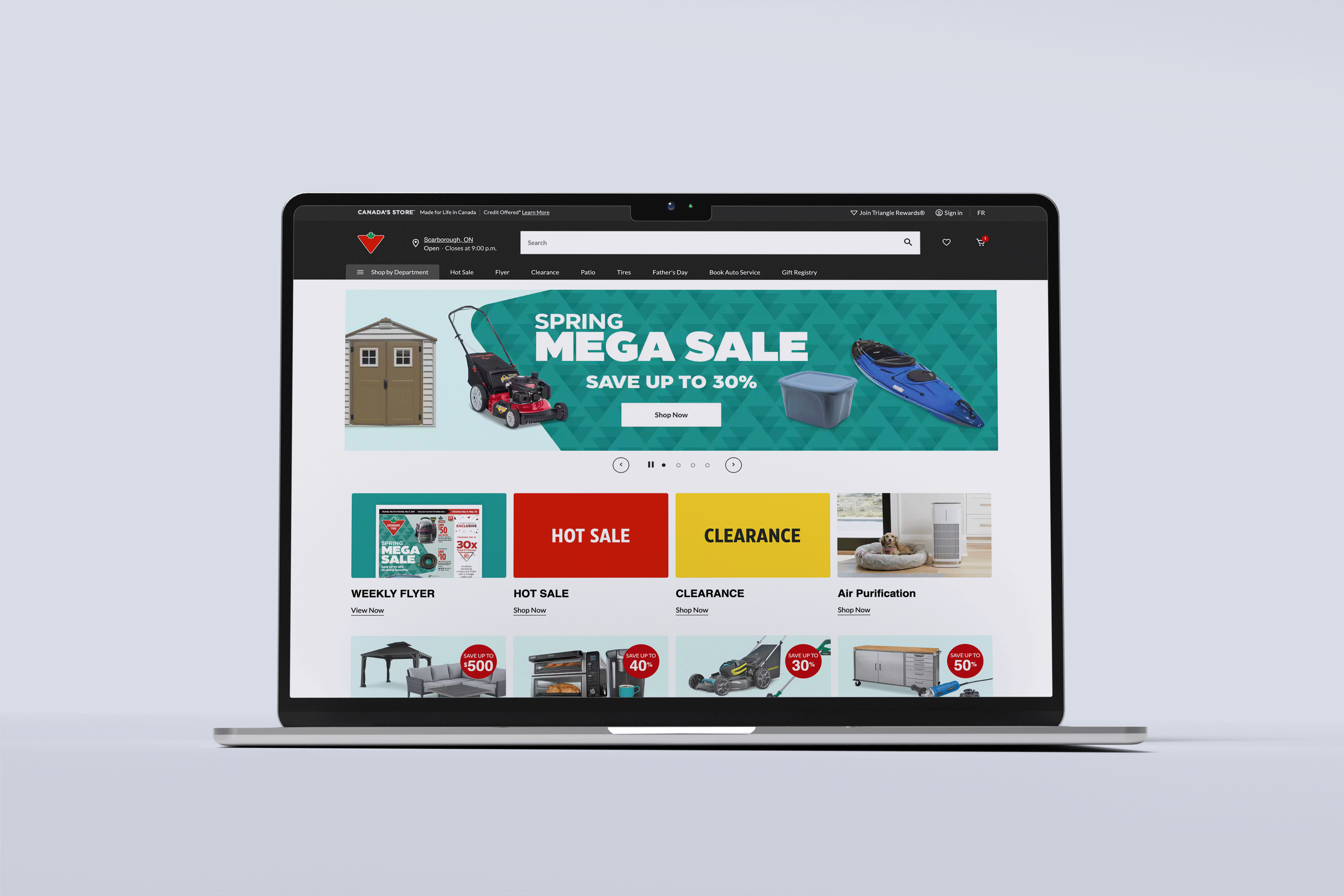
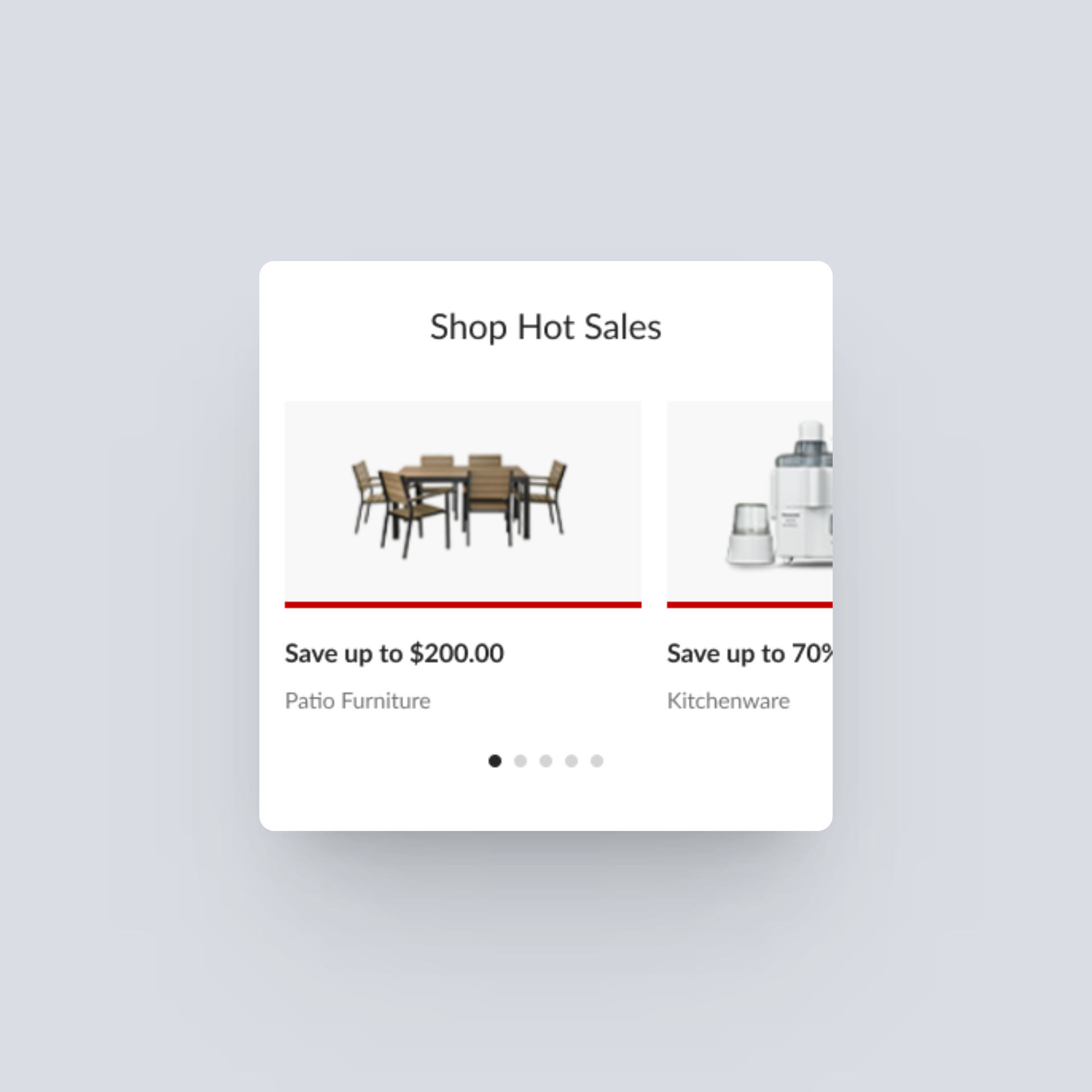
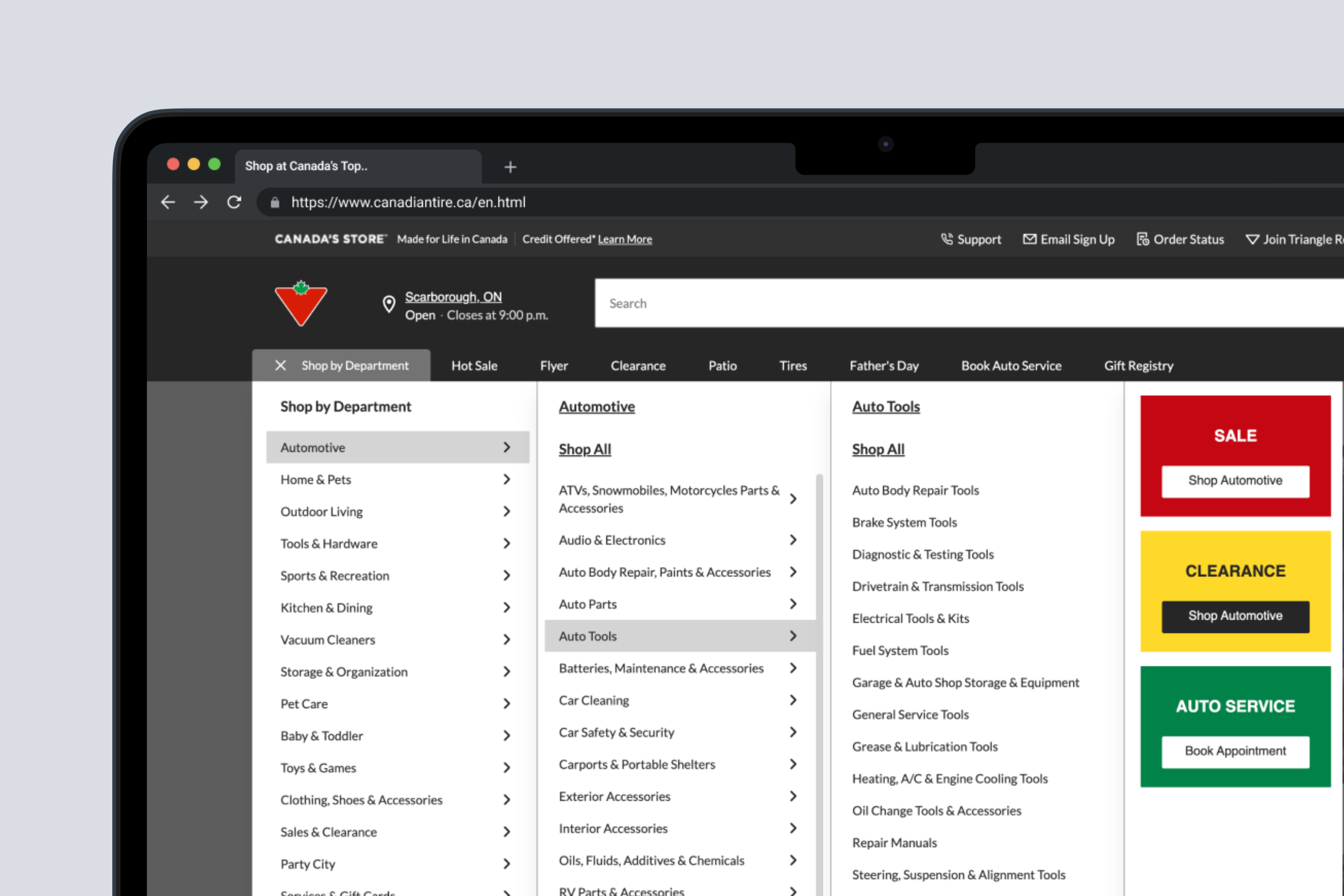
Homepage & Navigation
Simplifying navigation and providing clear guidance to support users find a product that they love.

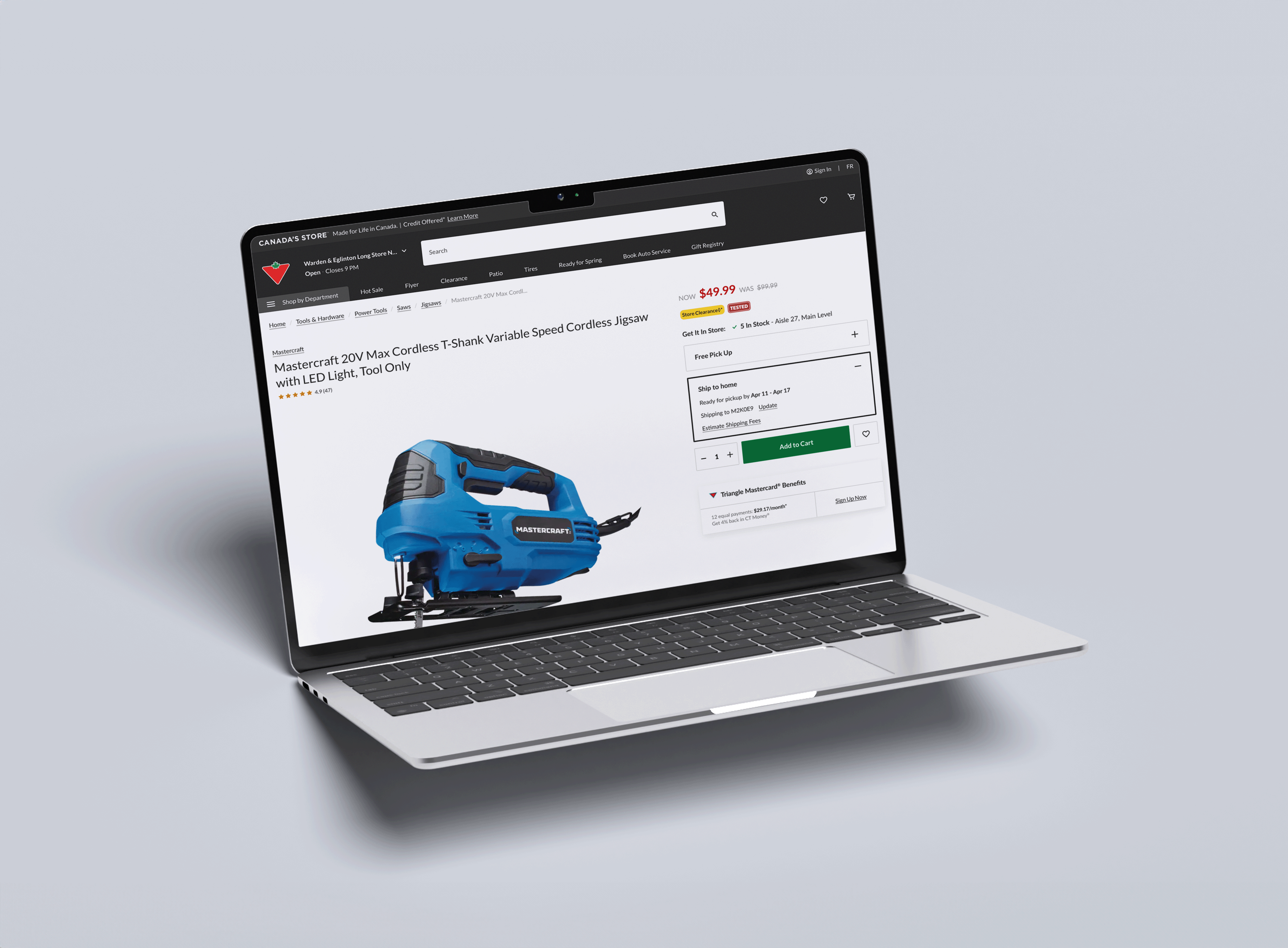
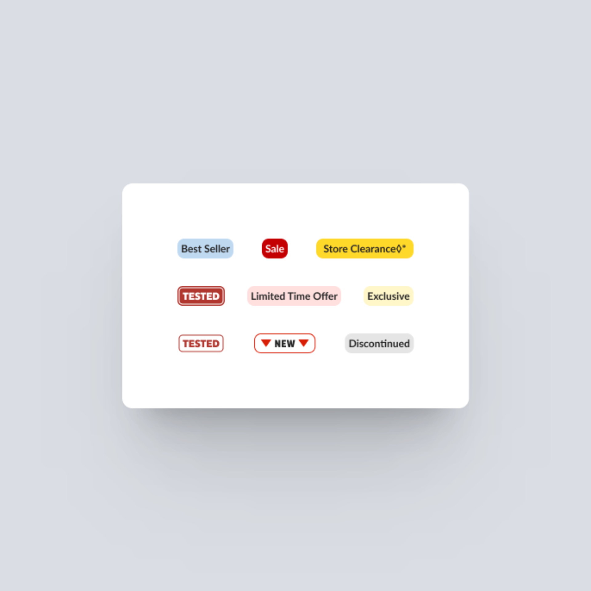
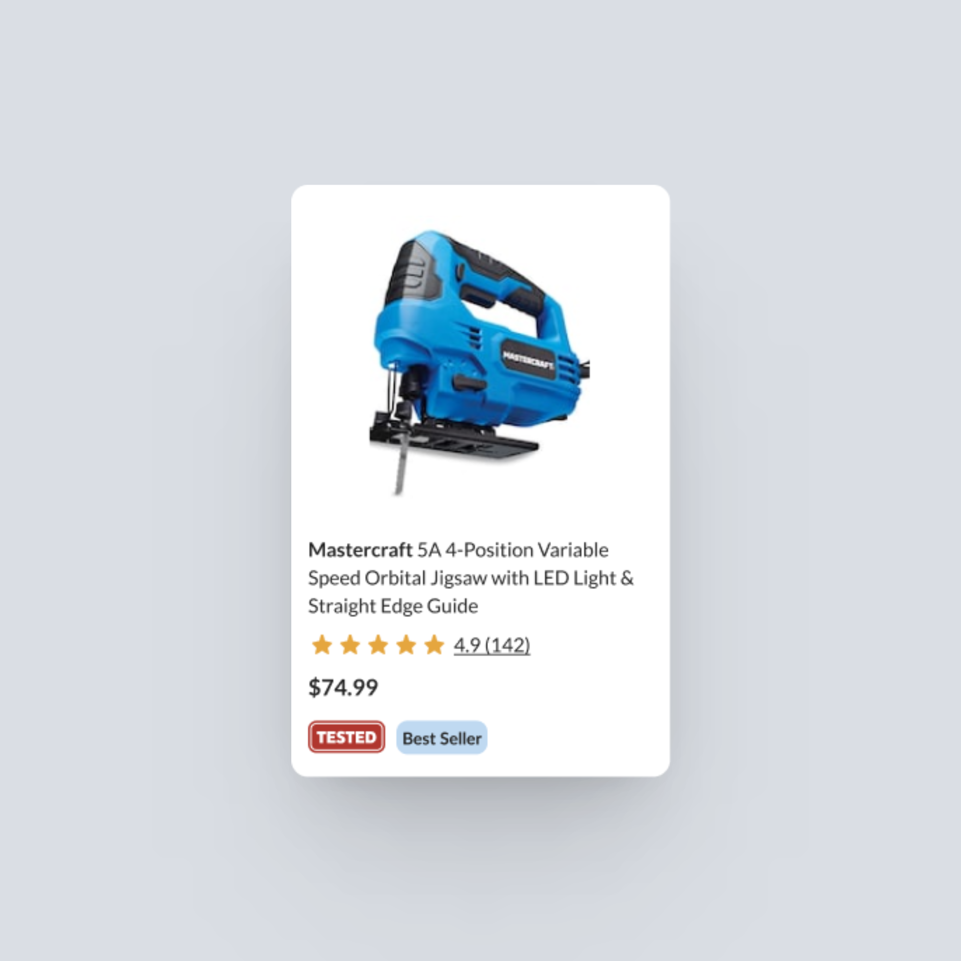
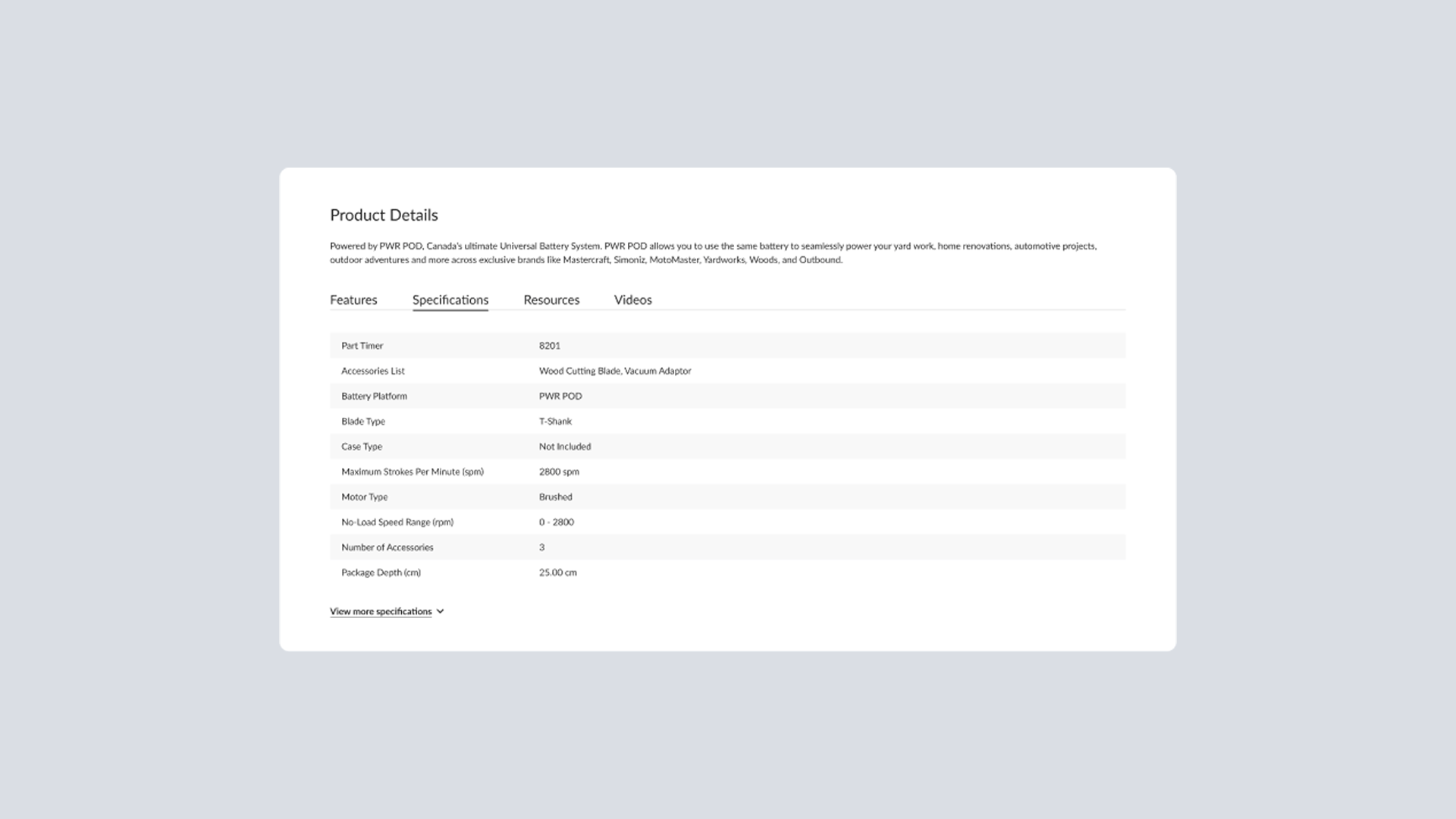
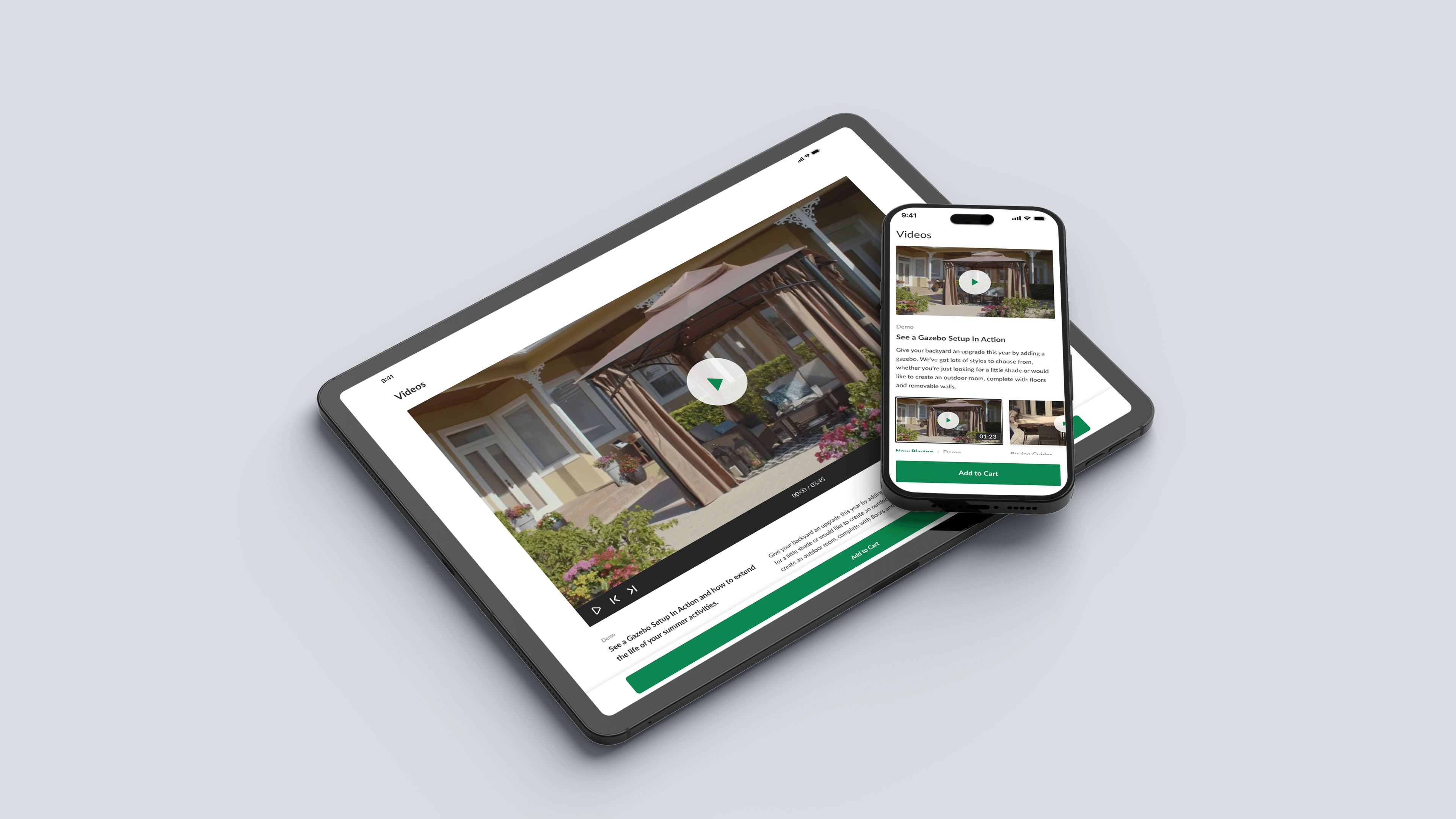
Product Details Page
Allowing customers to quickly assess product options and make informed purchase decisions.
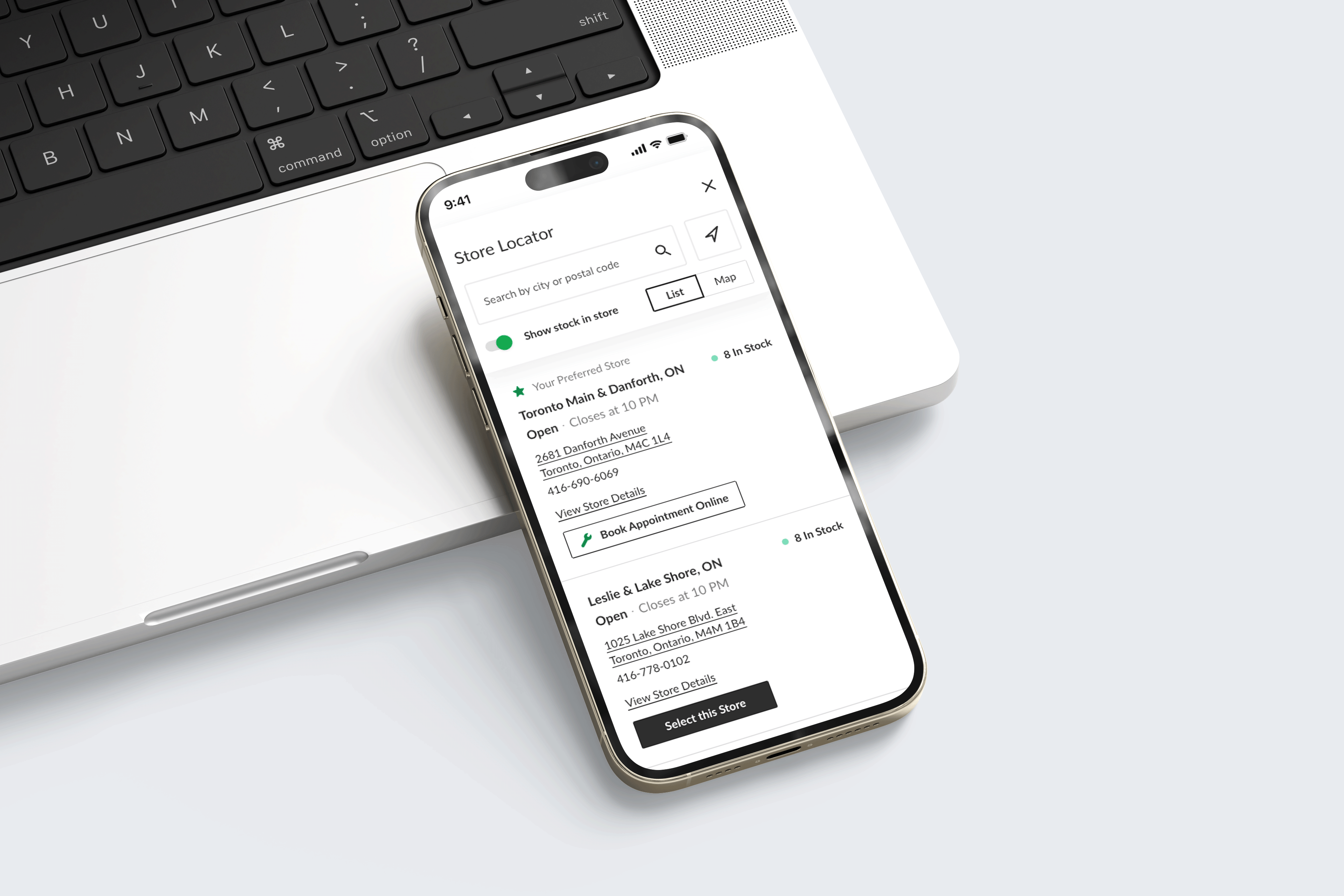
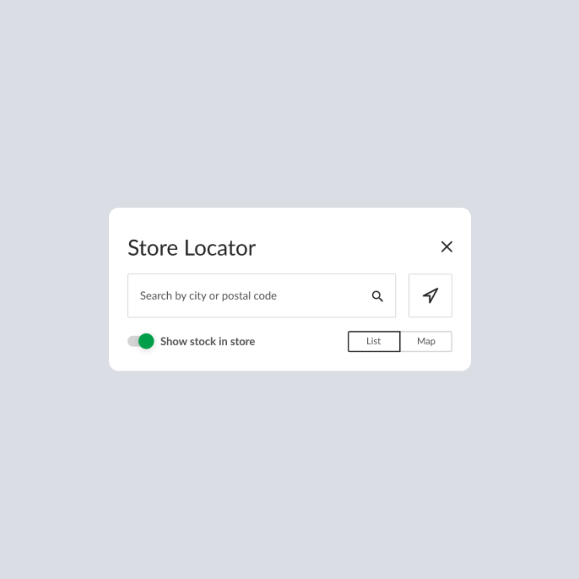
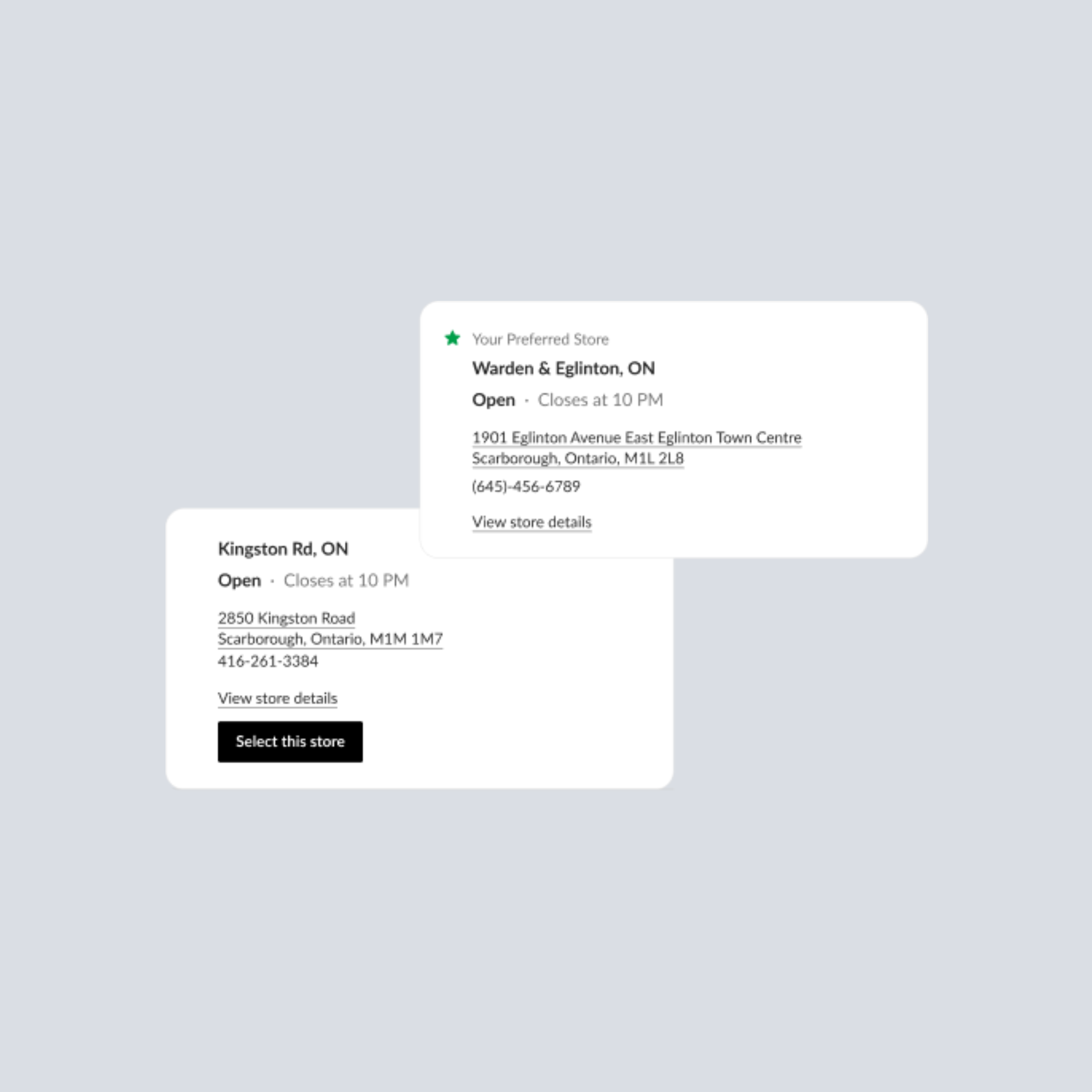
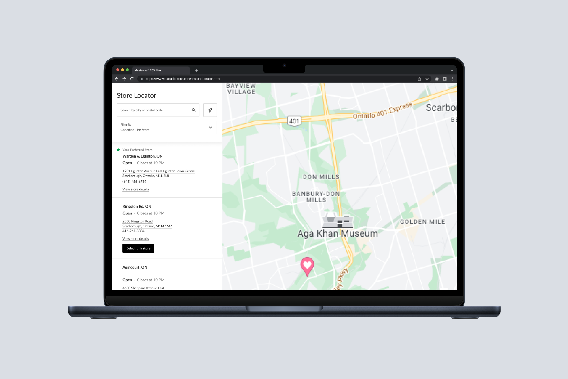
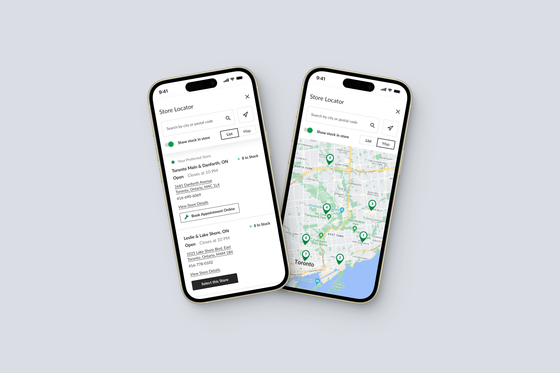
Store Locator
Providing shoppers the ability to locate their nearby stores, check store hours, view stock availability.
REFLECTION
The lessons learned from this project
Prioritize our users, not metrics.
Pushing back on business requests can always be challenging but we cannot forget who we’re designing for. When we focus on creating a splendid experience for our user, the revenue will follow. As a designer, it's up to me to champion our users for my team and to always see if there's more to it, such as statistics or qualitative data that could inform better decisions for our users.
There's no ego in successful design.
Being is a designer is not about being a one man army. I learned it is very difficult to drive outcomes by yourself. The beautiful thing about having collaboration is you’re able to share and extract ideas with your peers who share the same goal which is to move the needle as far the pushing the user experience is concerned.
Accessibility is a serious matter.
I witnessed first-hand of how frustrating an experience could be when not applicable to those with physical or cognitive disabilities. Little errors such as poor keyboard navigtion to low visual U.I contrast could lead to drastic negative implications on a user experiences our product ultimately leading to drop off.