Momentum
Digital Fitness Platform
From conceptulization to launch, I designed a fitness platform to help influencers monetize their audience.
About this project
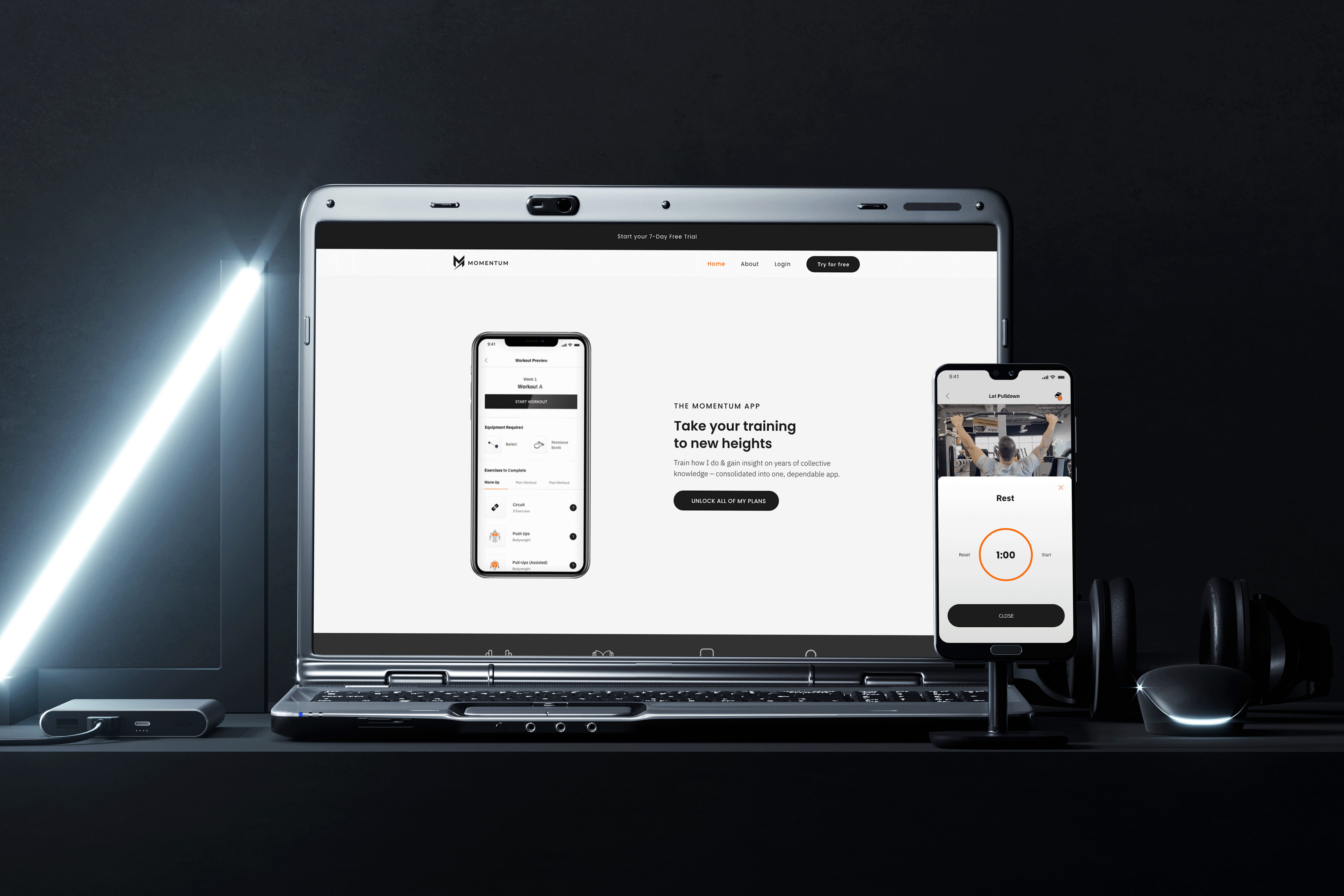
Momentum is a digital platform that help fitness influencers launch an online subscription business by providing their supporters with a digital wellness experience. Being part of the founding team and sole designer of this project, I was responsible for leading the design process from conceptualization to launch.
Challenge
Despite their immense popularity, most fitness influencers struggle with building sustainable income. Many fitness influencers of today are forced into hard-to-scale solutions when trying monetize.
The goal of this project was to conceptualize and design an end-to-end digital solution that offers fitness influencers accessibility to an additional stream of revenue while also being able to help their audience overcome the barriers to fitness.
Client
Oply Tech
Role
Lead Product Designer
Disciplines
Mobile App & Web Design
Interaction Design
Visual Design
Brand Identity & Guidelines
Market & UX Research
Design Systems
Business Strategy
Partnerships
Creating an impact through design
Monetization
Provided 5 fitness influencers an additional source of revenue, allowing them to effectively monetize their audience and expertise.
Transformation
Transformed hundreds of users lives, helping reach their fitness goals by providing access to their favourite influencers' content.
Affordability
Provided an affordable and interactive alternative for an audience seeking fitness guidance and plans from credible experts.
DISCOVER
Leveraging competitor insights and user feedback to refine our approach
Exploring the competitive landscape
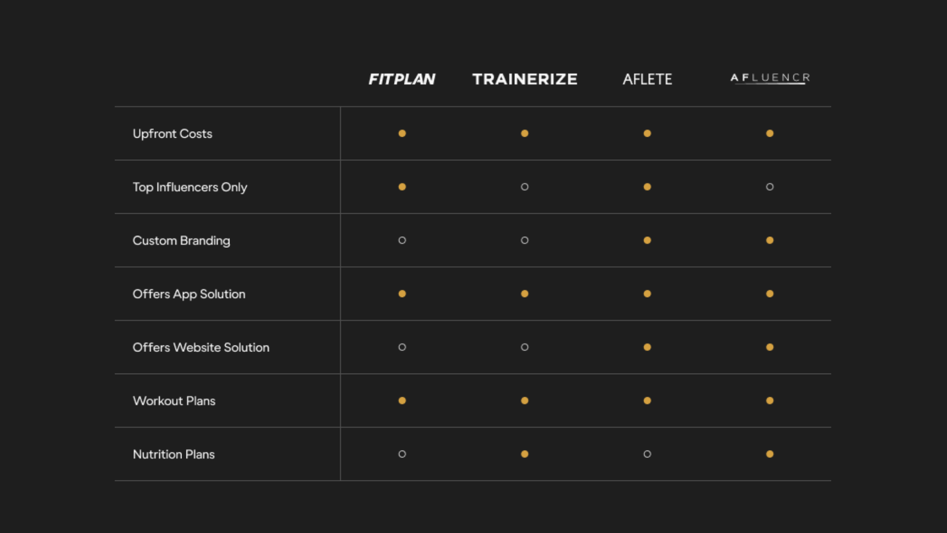
The project began with an in-depth analysis of potential competing competitors within the market. I was able to evaluate the following four platforms:
Identifying market gaps
After conducting a thorough competitor analysis, several key market gaps were identified. This helped shape our strategy to develop our platform.


Brainstorming audience insights
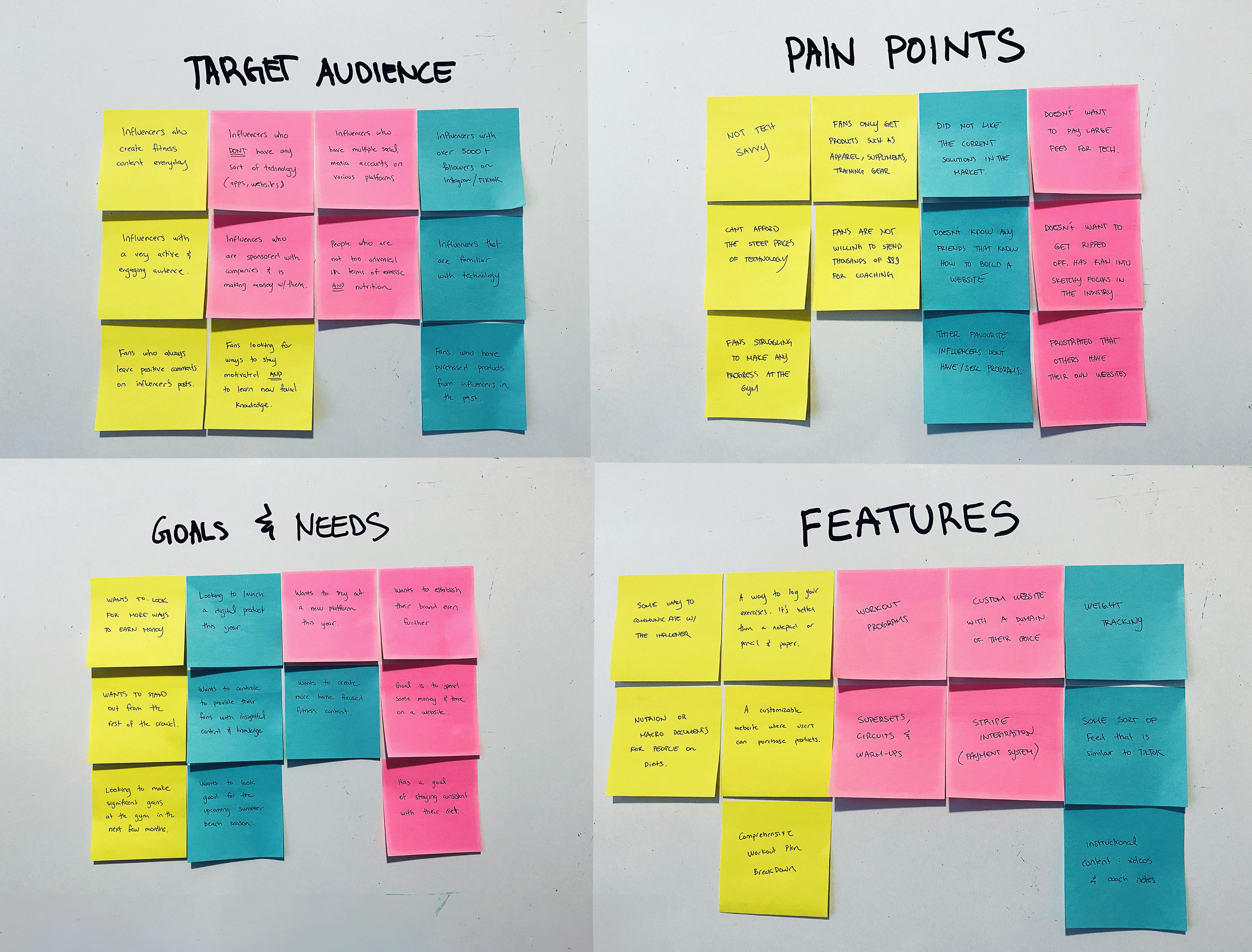
Building on insights from the competitor analysis, our team brainstormed assumptions about our target audience. We used Affinity Mapping to organize our collective thoughts.
Establising a targeted user research plan
Based on the above, I wanted to focus on two particular groups of individuals:

Test Group A
Individuals with at least 5000+ followers and posts fitness-related content regularly.

Test Group B
Individuals who consume fitness influencer content from social media on a daily basis.
Conducting User Interviews
I conducted a total of 9 interviews. Each interview was broken down into two parts:

Part I. Qualitative Interviews
This allowed me to build a high-level user profile of each participant, noting their behaviours, goals and pain points.

Part II. Light Usability Testing
Observing each participant use competitor's platform to obtain direct feedback on user flows and features.
Findings from our research
These are a list of the most important findings from my research:
Group A: Total of 4 Participants


Group B: Total of 5 Participants


DEFINE
Translating research insights to shape our design strategy
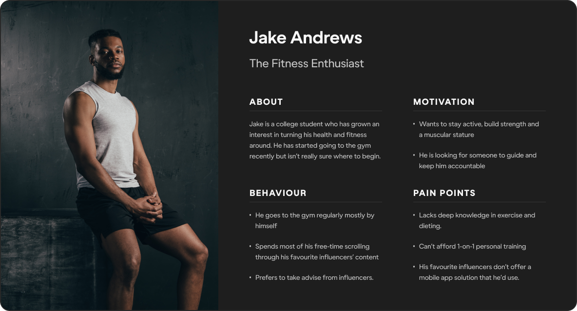
Defining User Archetypes
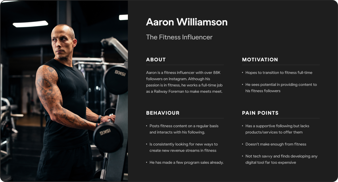
From my research, I was able to determine the two archetypes that represented our primary user groups:
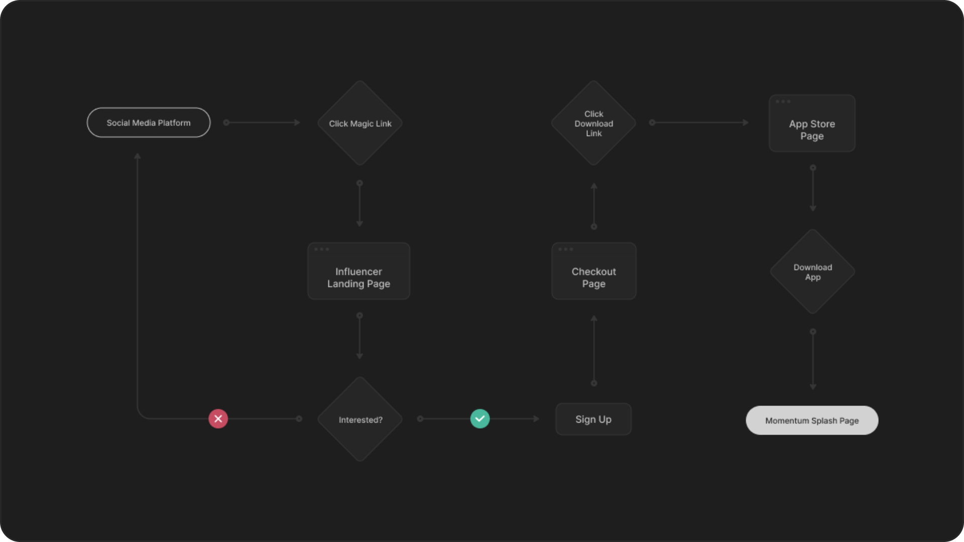
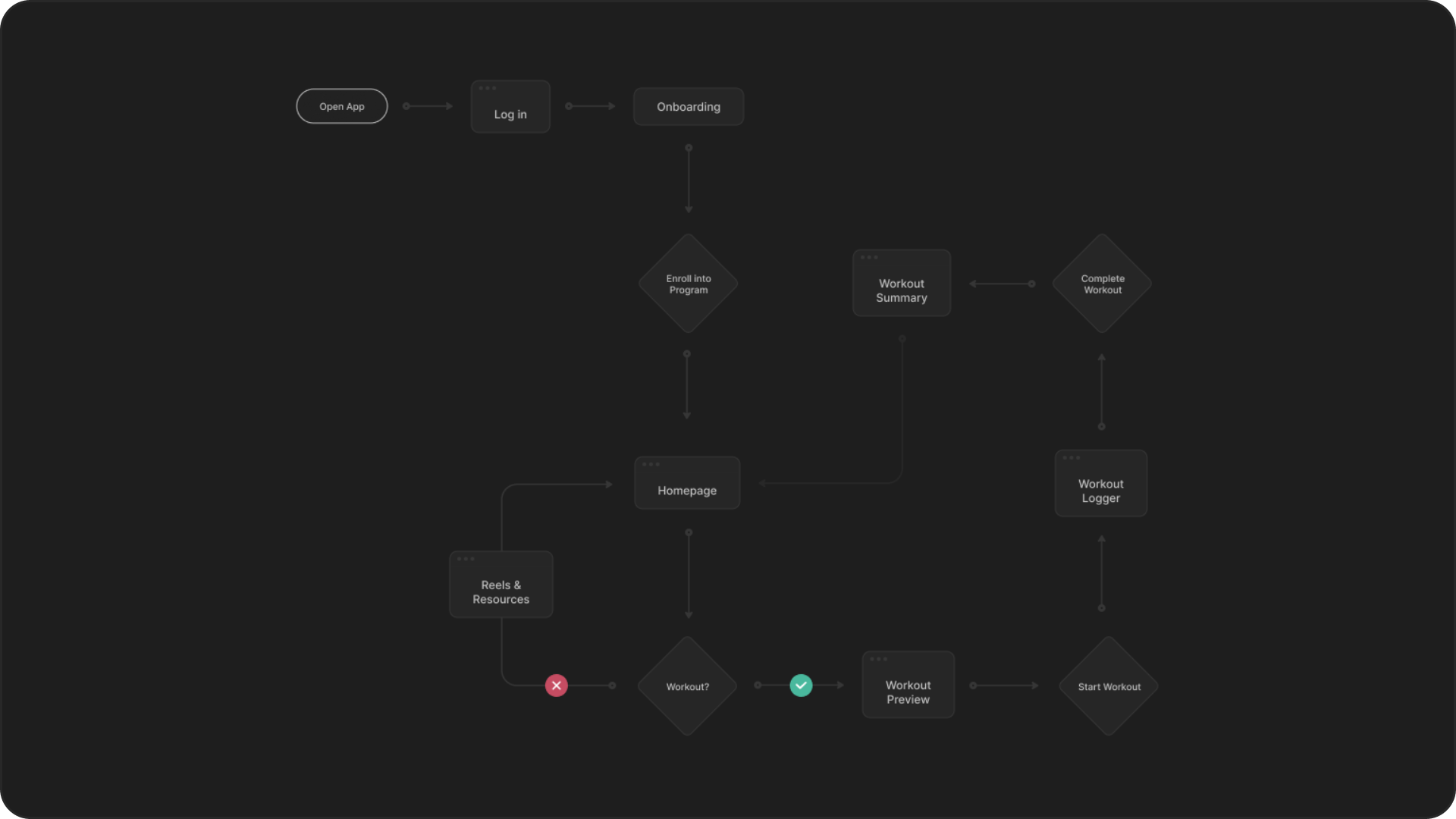
Mapping out user interaction
Before designing, it was imperative for me to understand how the customer interacted with our platform
DESIGN
Crafting functional designs from our strategic framework
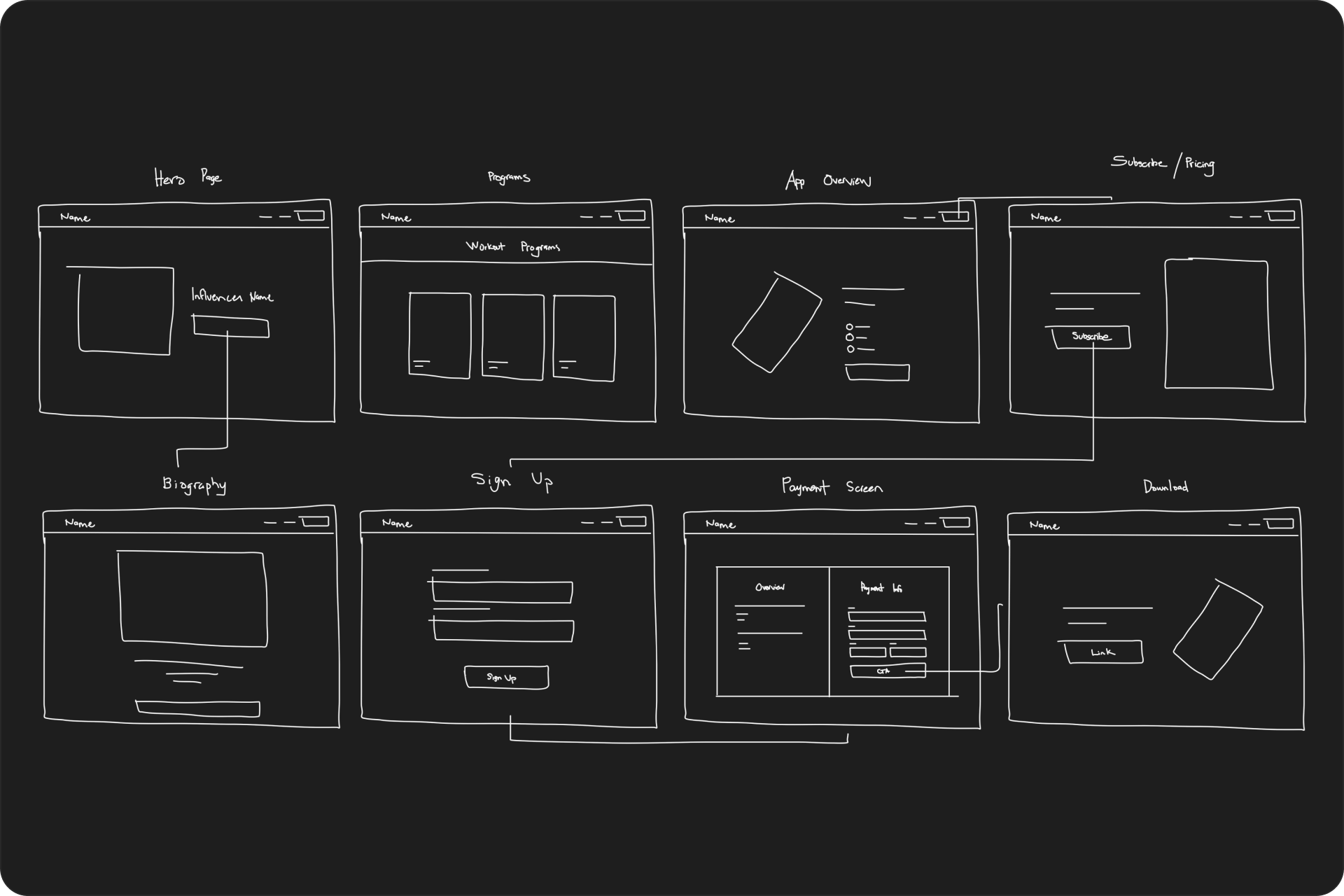
Sketching & Wireframing
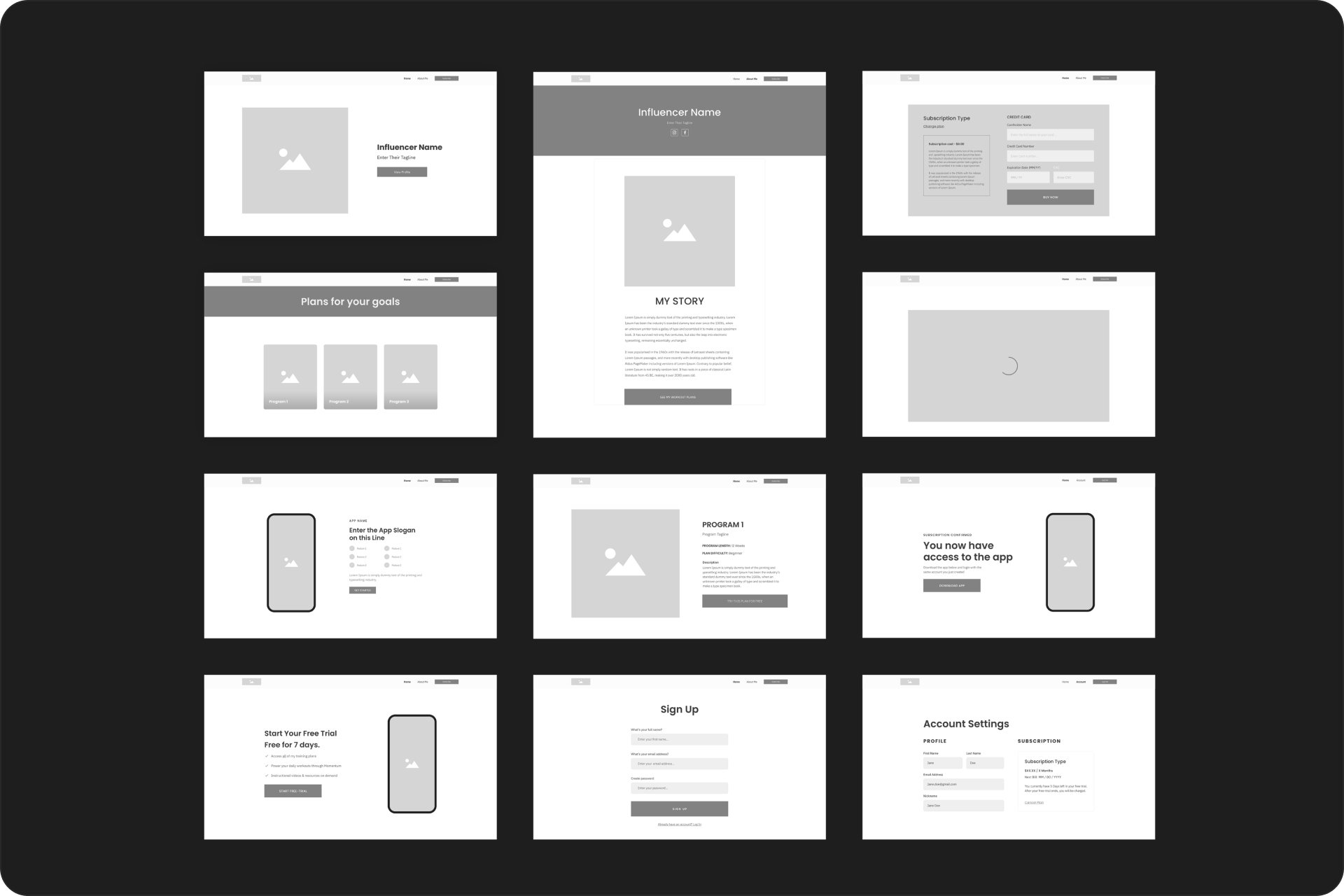
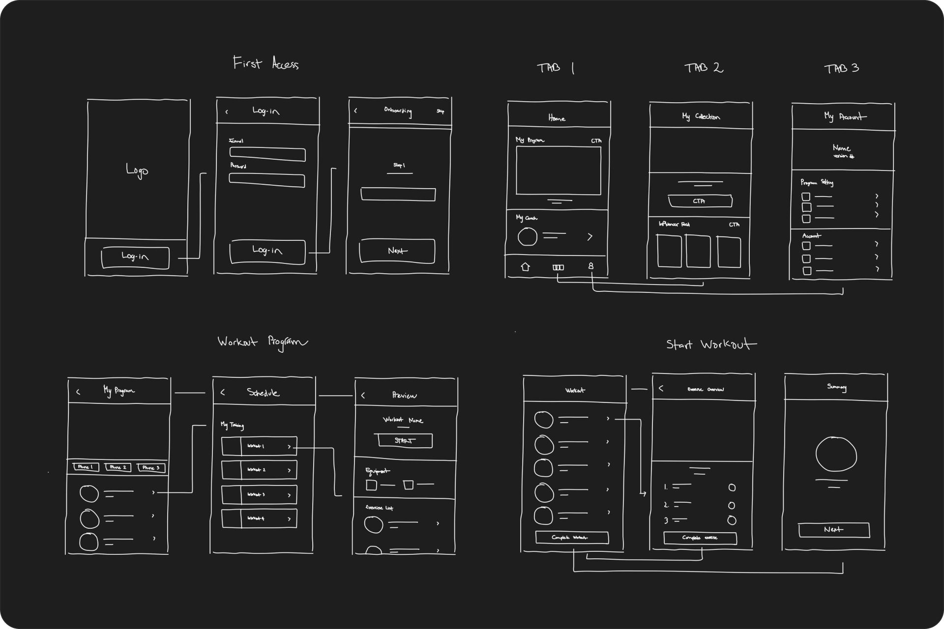
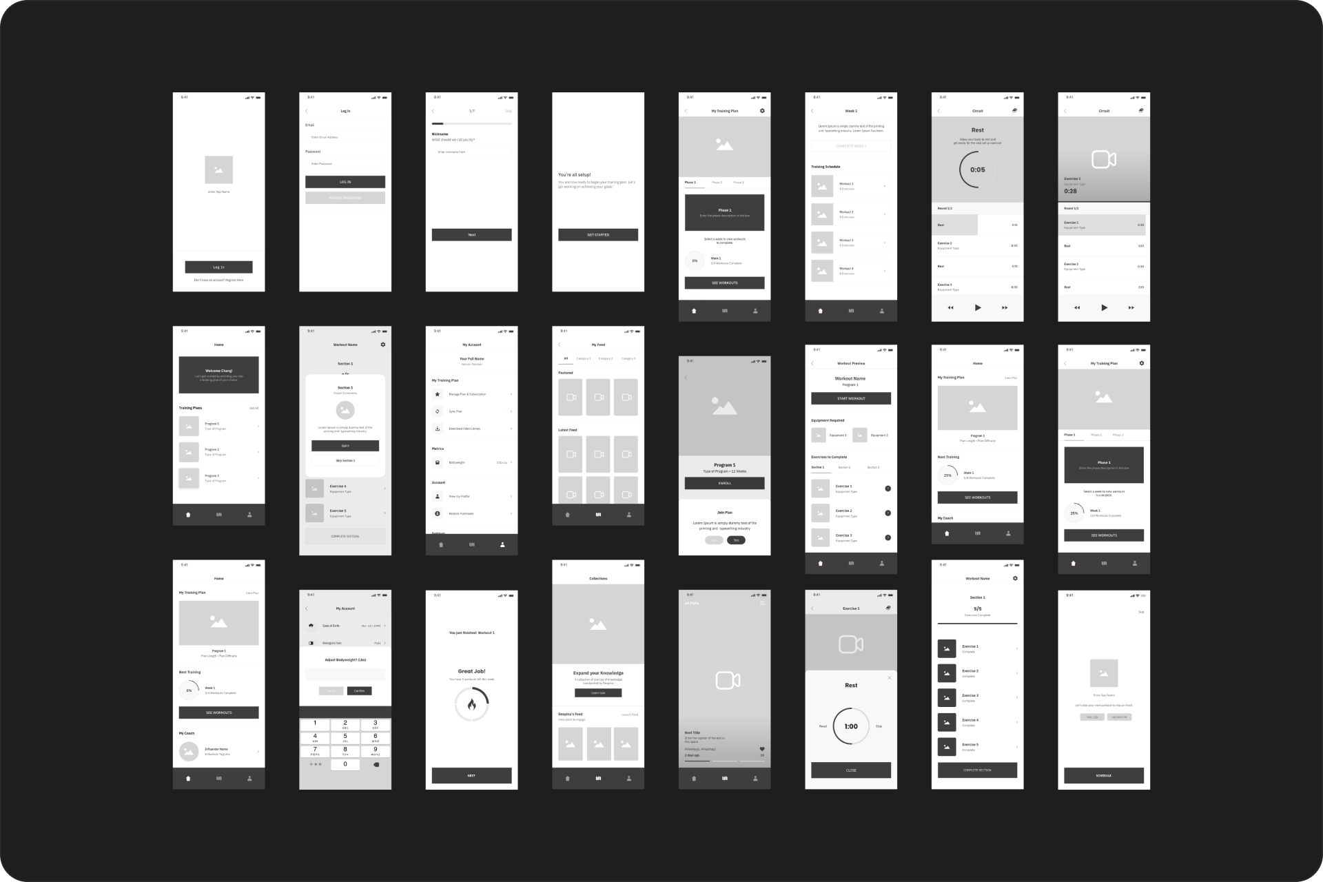
To begin the visual design process, I created concept sketches and low-fidelity wireframes to visualize the core features of the platform.
Mid-fidelity prototype
Developing mid-fidelity prototypes helped us fine-tune our designs.
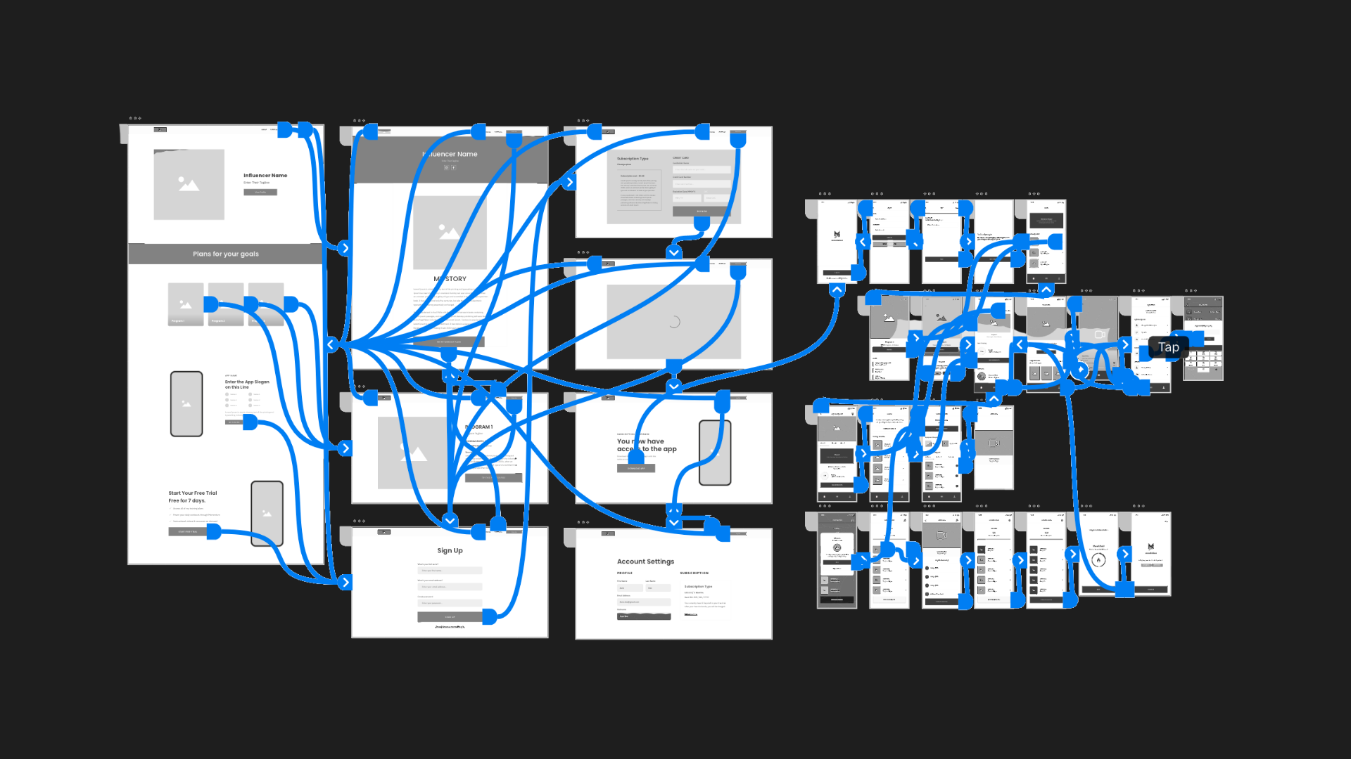
Usability testing our prototype
Using the prototype, I proceeded to conduct a series of usability tests with the original testing group. This process was a back-and-forth cycle of gathering feedback and making iterations to our platform
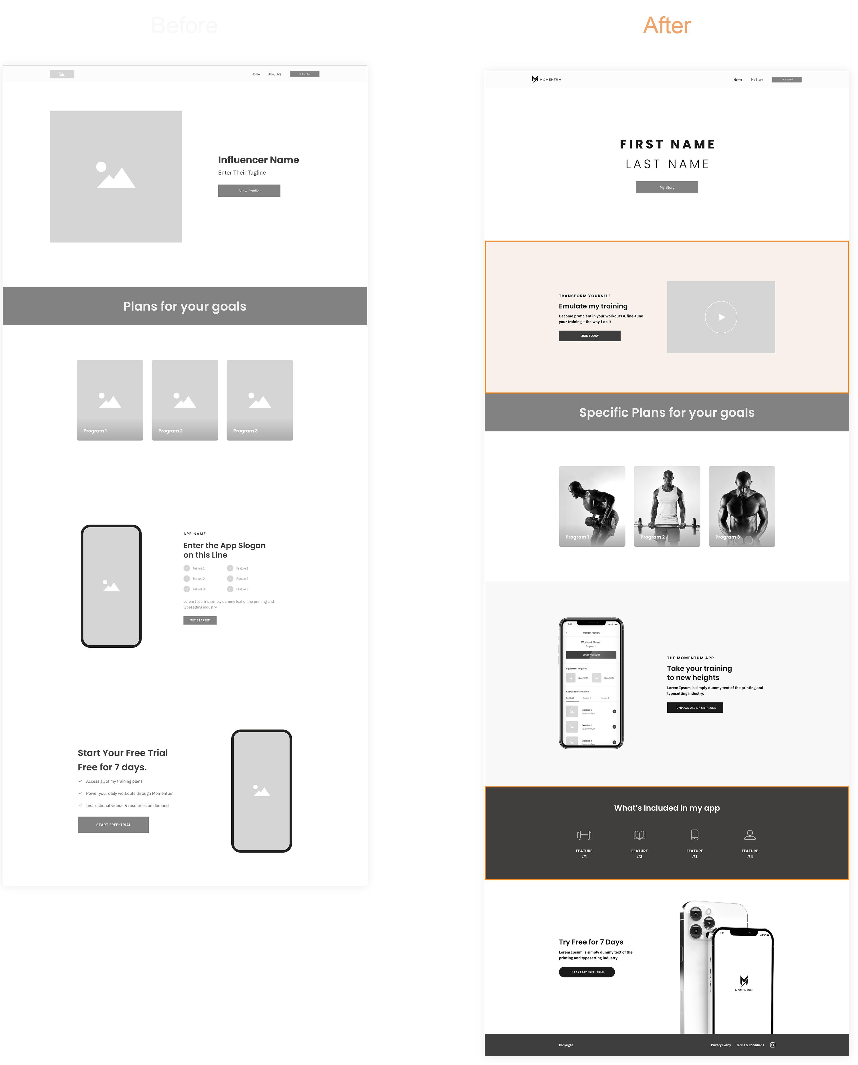
Iteration #1
Improving personalization
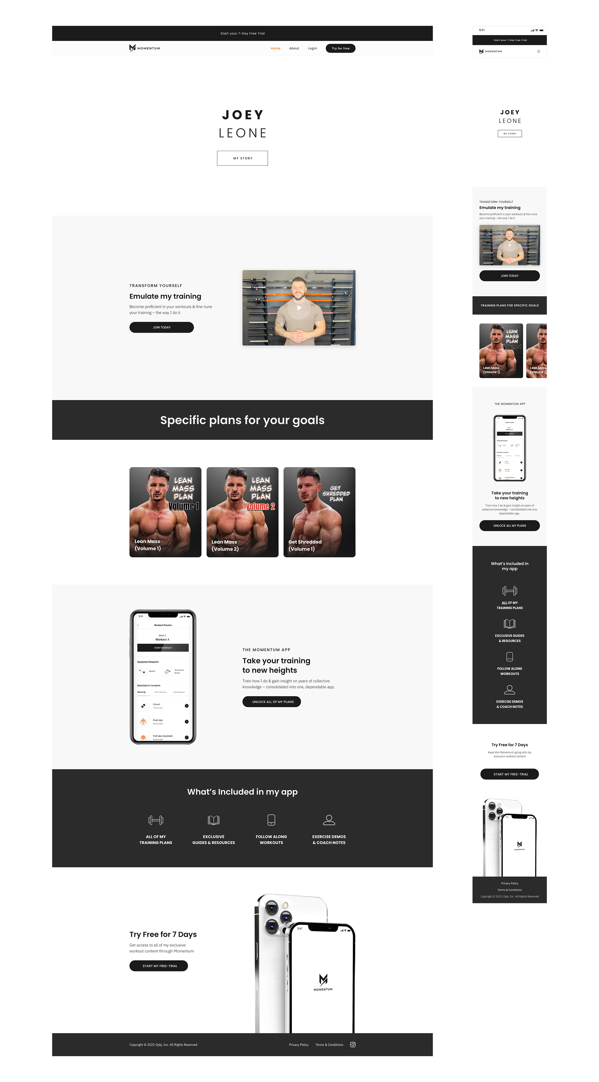
We added a video section to the influencer website, helping enhance personalization which resulted in a higher conversion rate by better engaging potential customers.
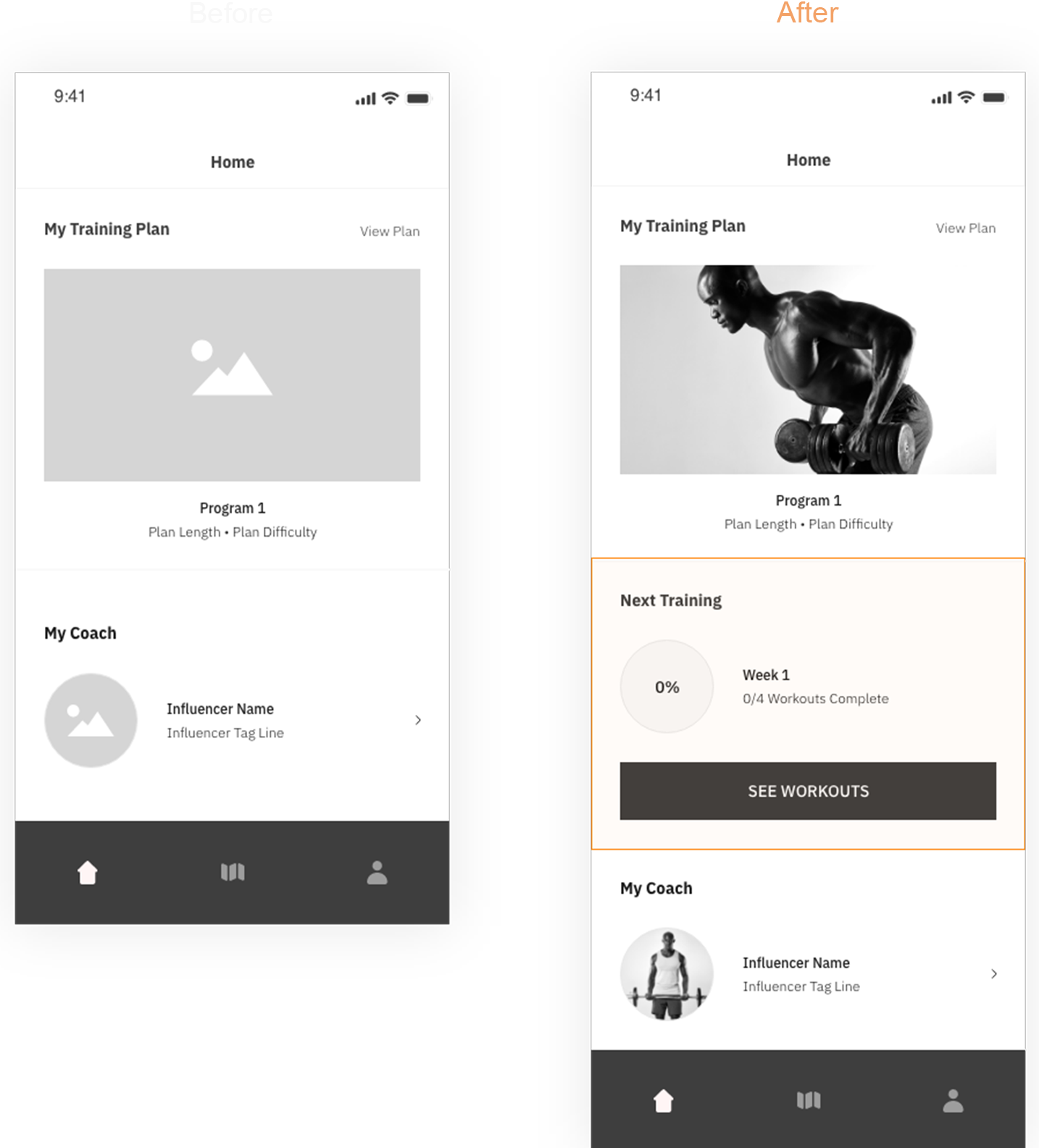
Iteration #2
Steamlining Workout Access
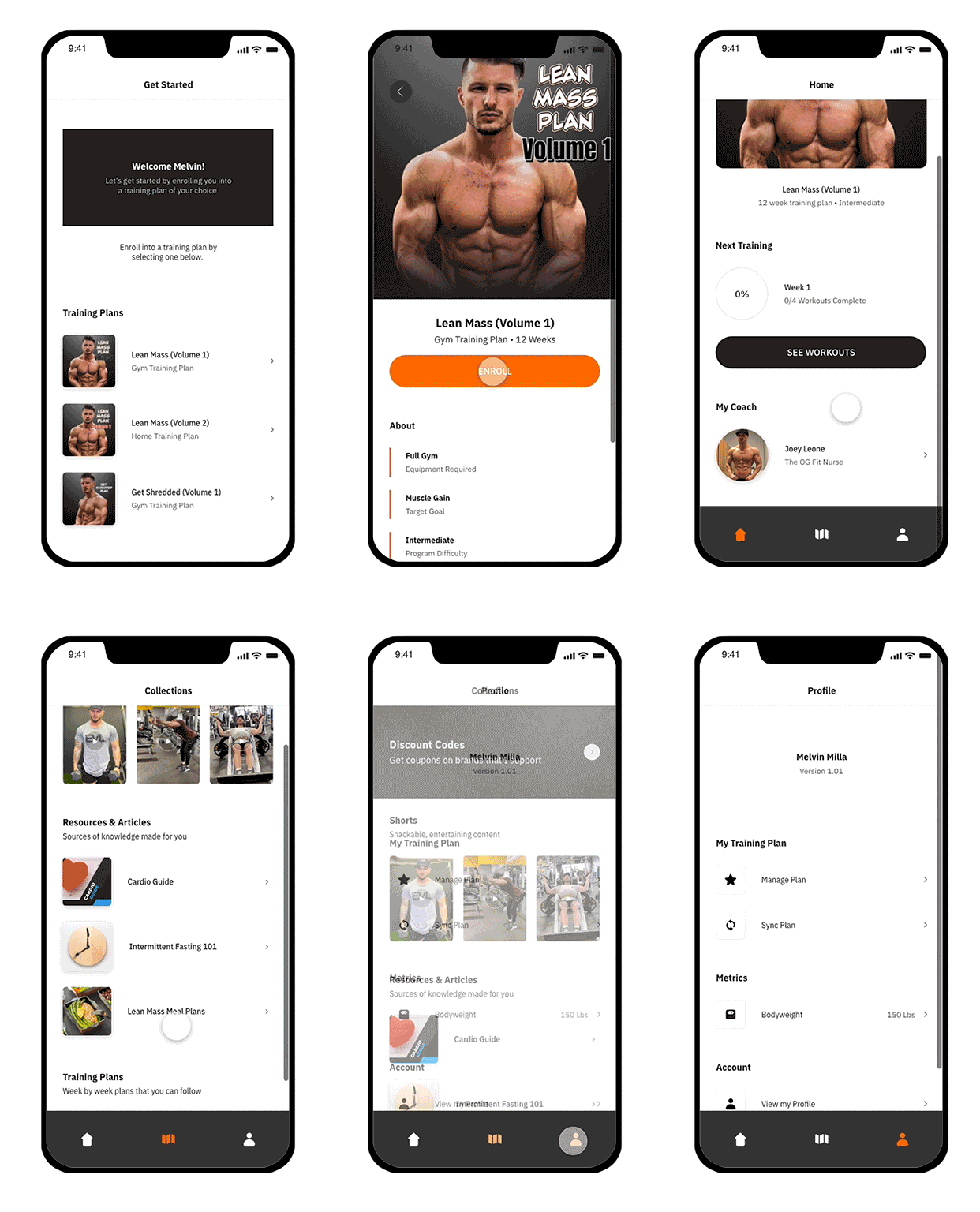
Participants requested a quicker way to start a workout on the app. By adding a "Next Training" section on the homepage, we reduced the steps to start a workout from five to three.
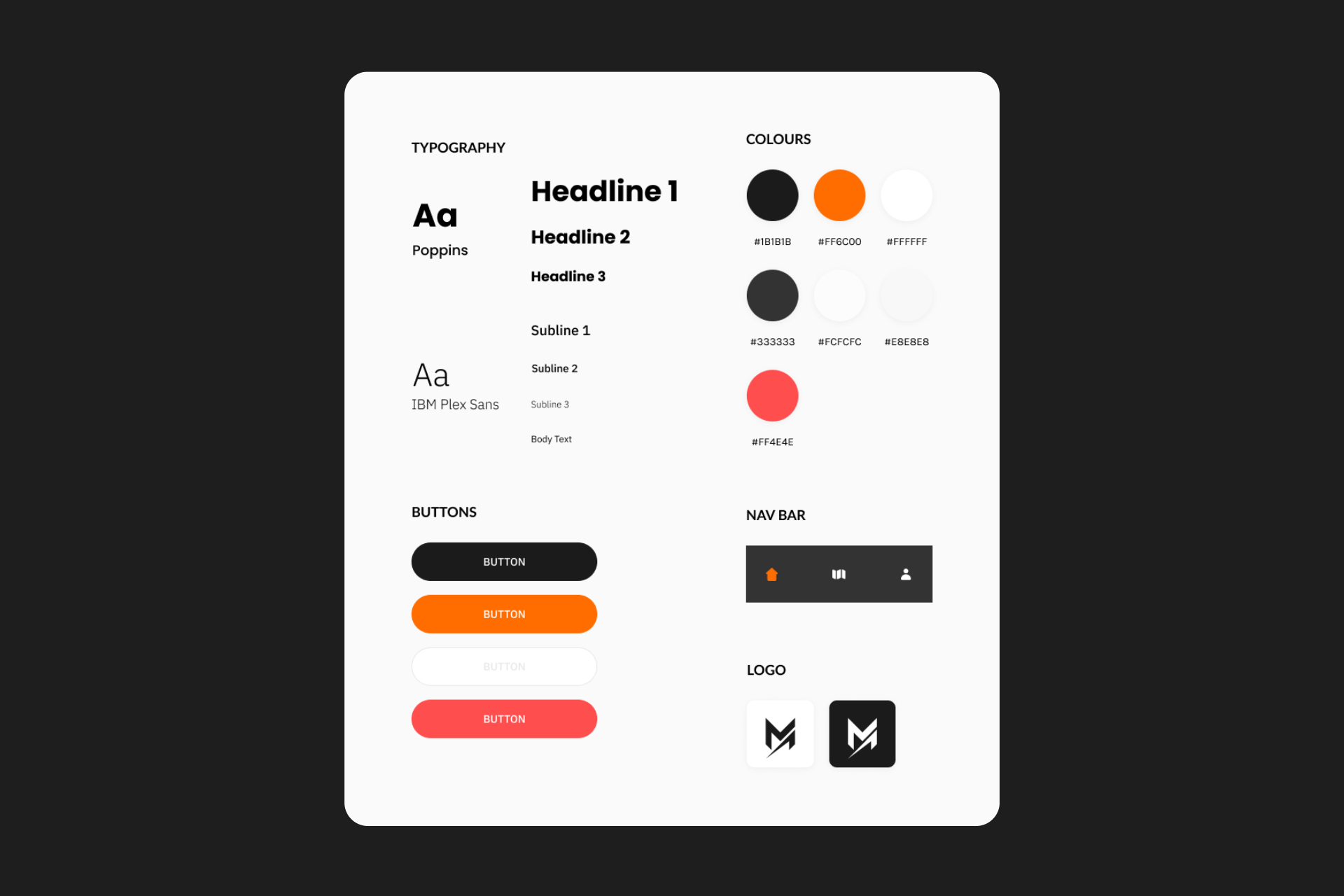
Establishing the styleguide
To cap things off, I finalized typography, color schemes, and component usage across the platform.
LAUNCH
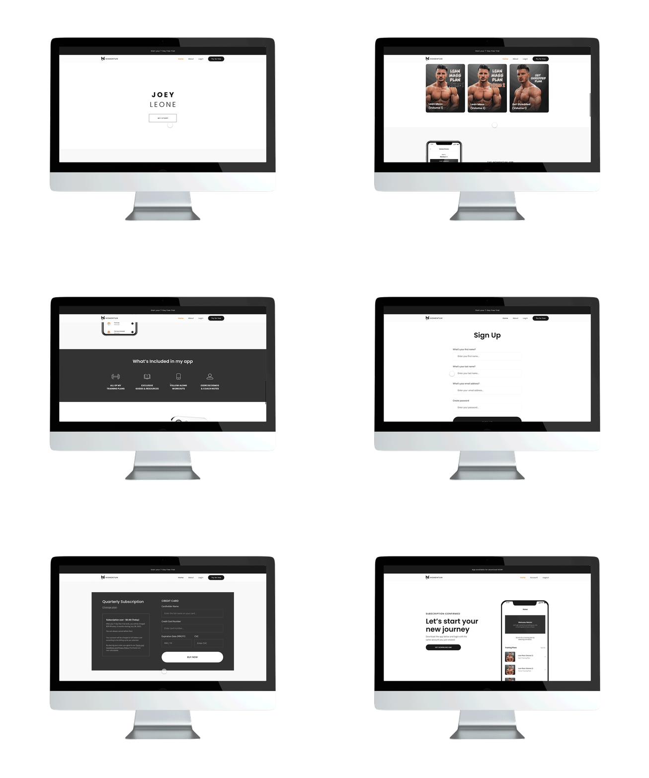
Helping fitness influencers launch an online subscription business
Influencer Landing Page
Funnel supporters to your own customizable website & earn revenue for each subscription made.
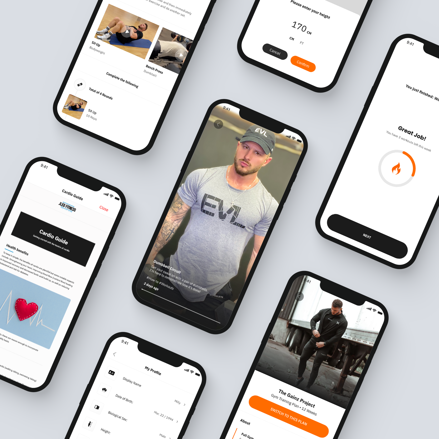
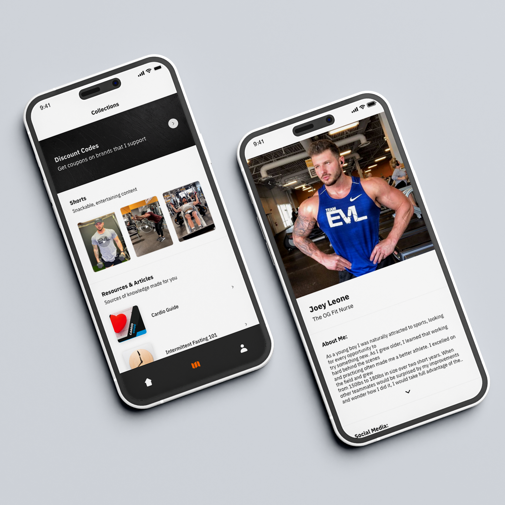
Digital Wellness App
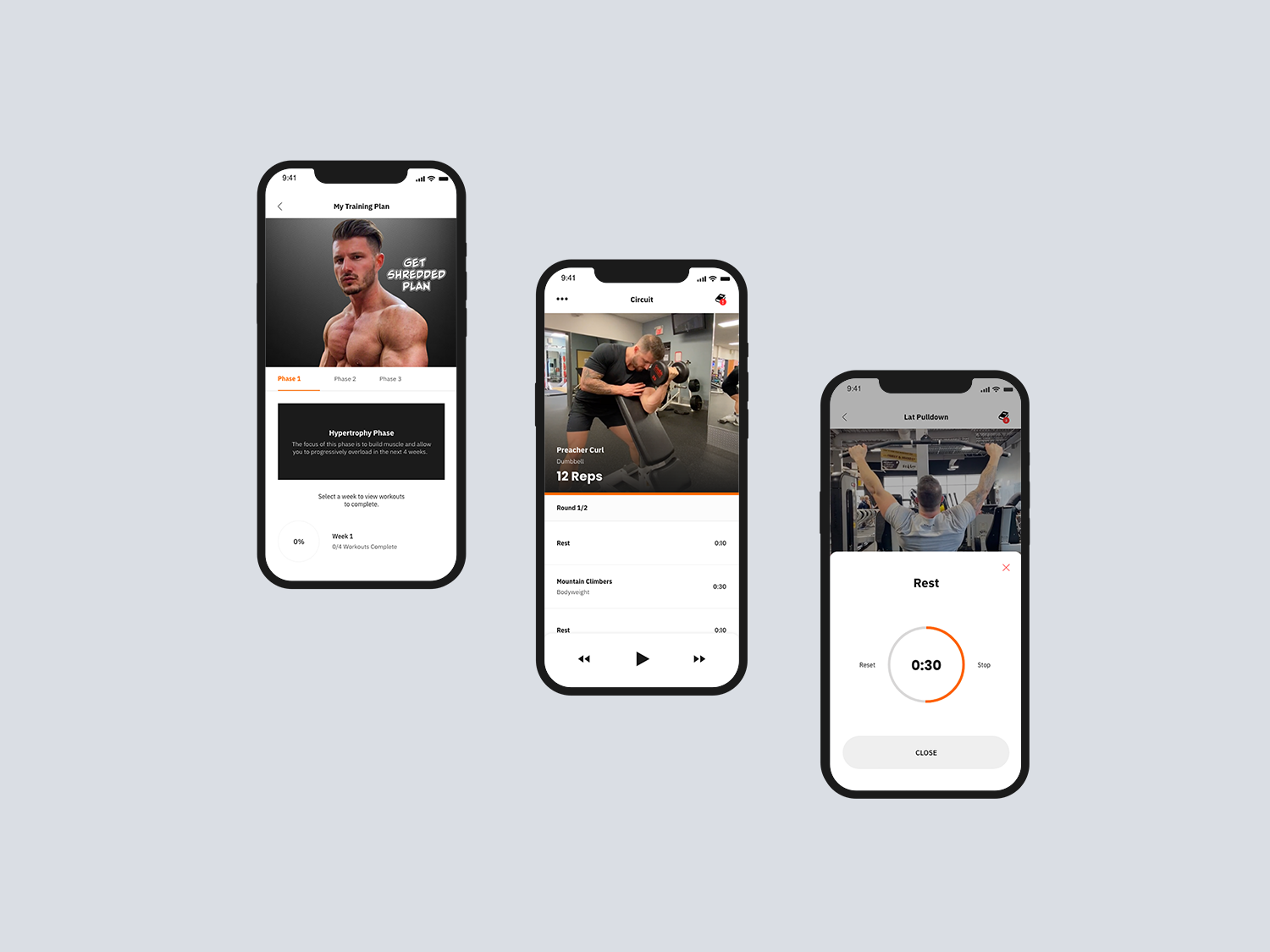
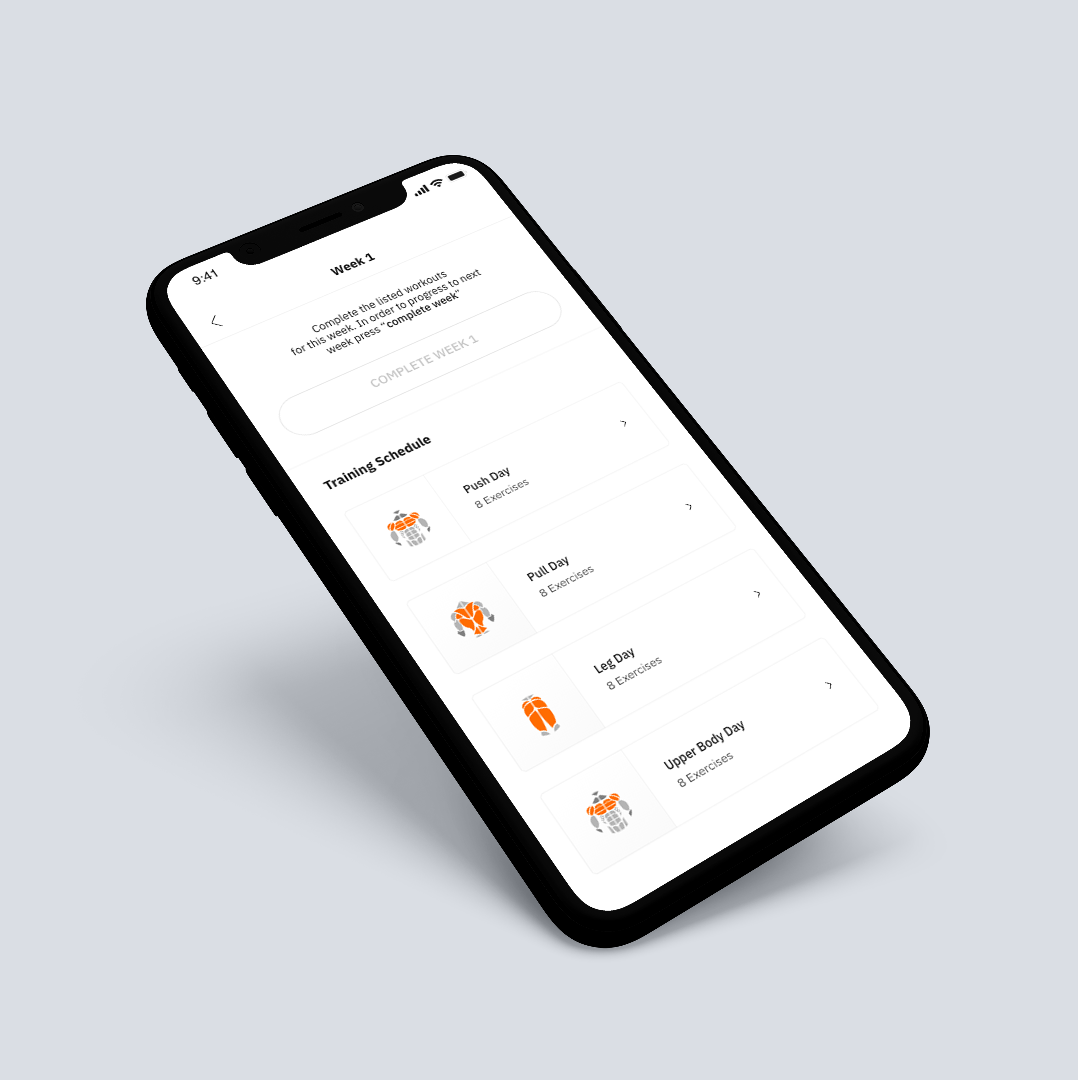
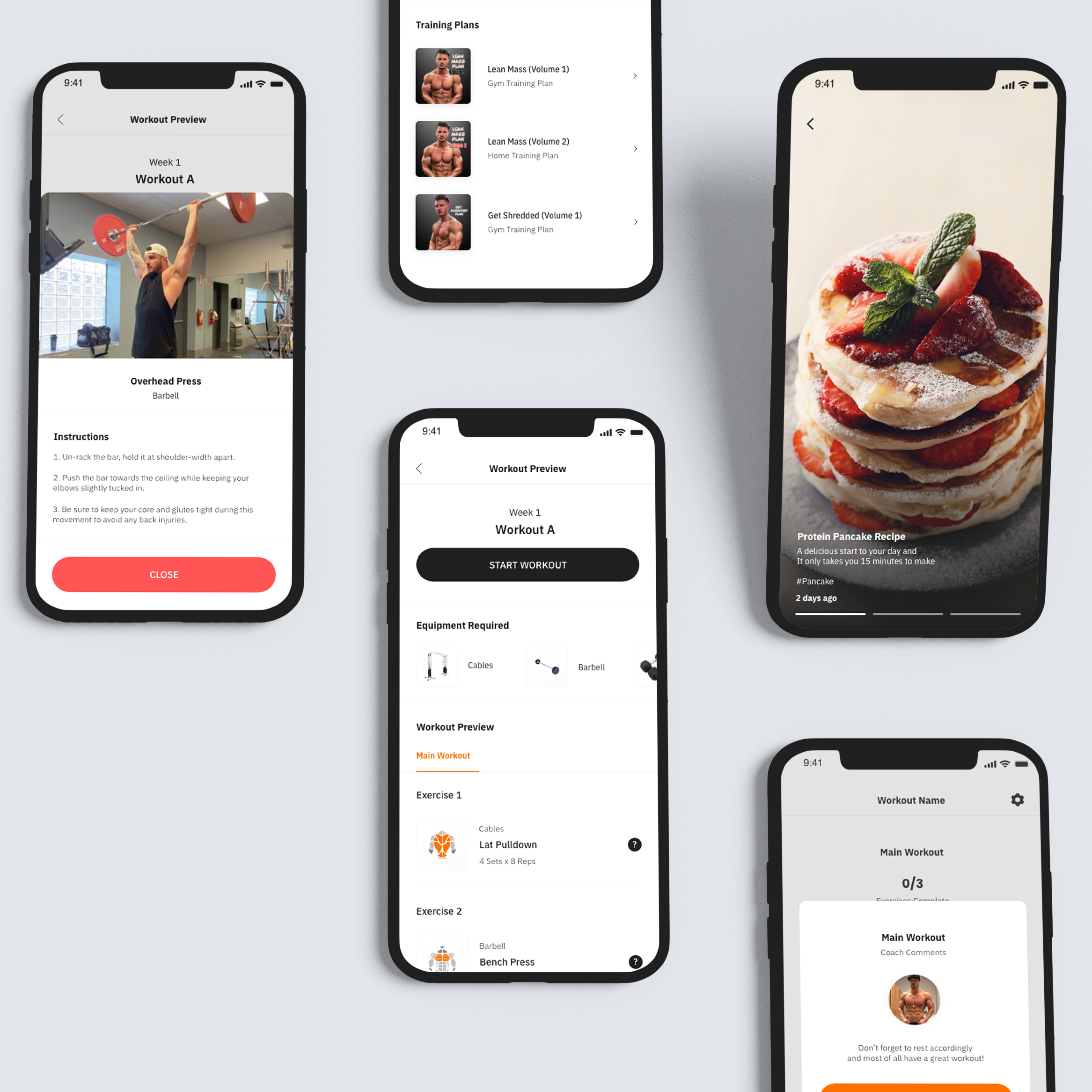
Provide your supporters with a digital wellness experience, packed with your unique workouts & more.
REFLECTION
Learnings from this project
Bells & whistles are for later.
While designing this project, I found myself spending too much creative effort on lower impact features. Although my goal was to build the best possible user experience, I learned that it is easy to be distracted by creating bells-and-whistles for features that do not need be so complex.
A mobile-first design approach.
I made the mistake of initially designing the influencer website using a desktop-first approach. Based on the business model, it should have been obvious that customers would be accessing the website through their phones. Because of this mistake, I spent a lot of time re-iterating the initial design to be more mobile-friendly.
Dummy-proof the experience.
Through extensive usability testing with many participants during this project, I learned that some things that may seem obvious for me doesn’t necessarily mean it will be obvious for others. By simplifying the features as much as I could, participants were able have an easier time understanding the value of our platform.