Rhea Health
Concussion Rehabilitation App
Mobile app design for Rhea, a startup dedicated to accelerating recovery for people suffering from concussion.
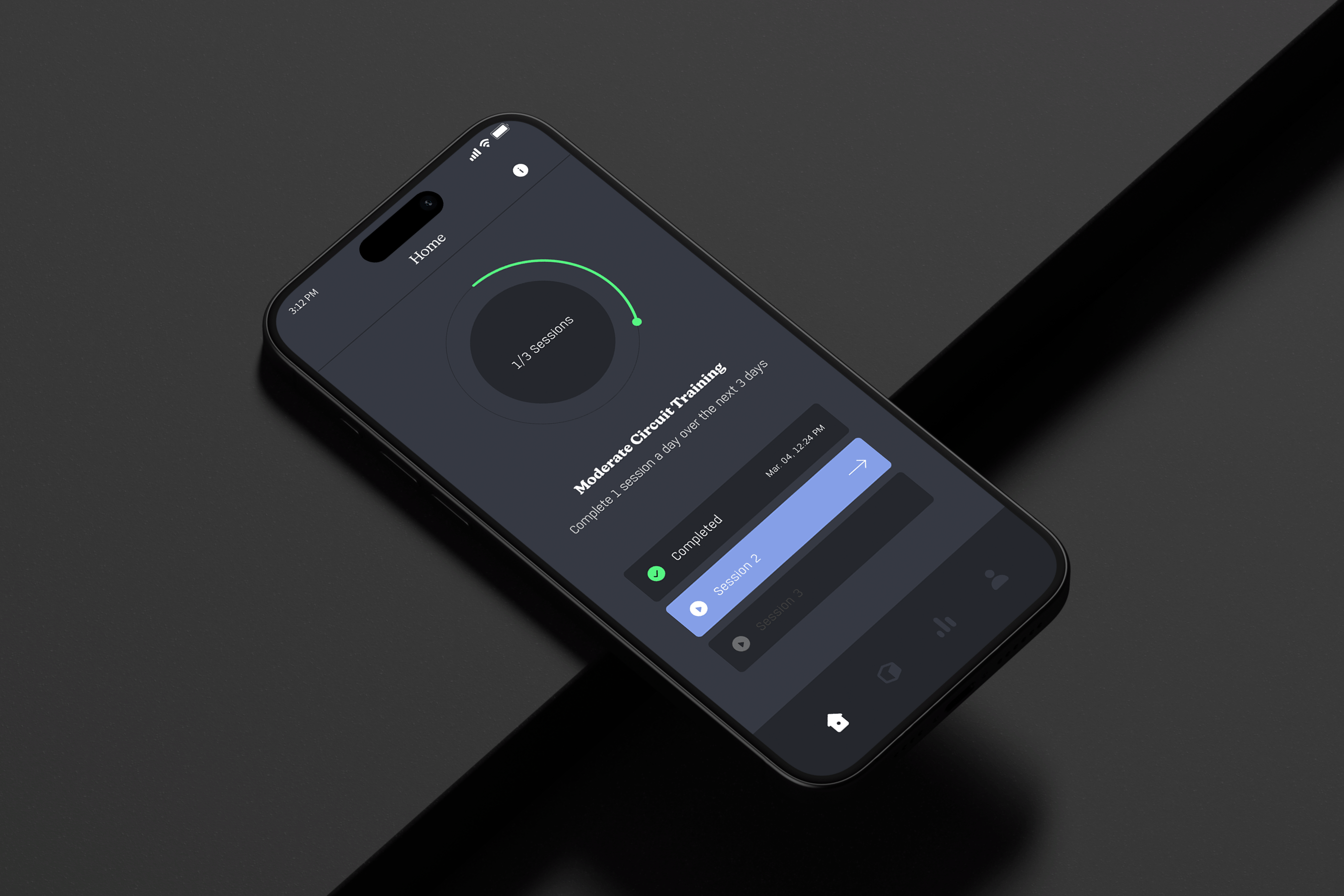
About this project
Rhea is a rehabilitation platform that’s grounded in science and uses prescribed physical exercises to heal and care for the brain. I was responsible for conceptualizing and designing the MVP version of their mobile app. The app was to be later used for their clinical trials.
Challenge
There’s such a complicated range of concussion symptoms that there’s no one-size-fits-all approach. The traditional advice was to prescribe rest and darkness, then wait and see. But the longer it takes the brain to recover, the more of an impact it has on someone’s work, social life and emotional wellbeing.
Client
Rhea Health Inc.
Role
UX Designer
Disciplines
Mobile App Design
Interaction Design
UX Research
Information Architecture
Design Systems
Brand Guidelines
Handoff & Documentation
Creating an impact through design
Personalization
Provided personalized rehabilitation plans, tailoring exercises to their symptoms and specific recovery needs.
Compliance
Ensured compliance with relevant health regulations and standards, providing a credible platform for users.
Clinical Integration
Backed by scientific research, we integrated clinical recommendations within the app for concussion management.
DISCOVER
Familiarizing ourselves with the problem Rhea was looking to solve
Understanding our client's vision
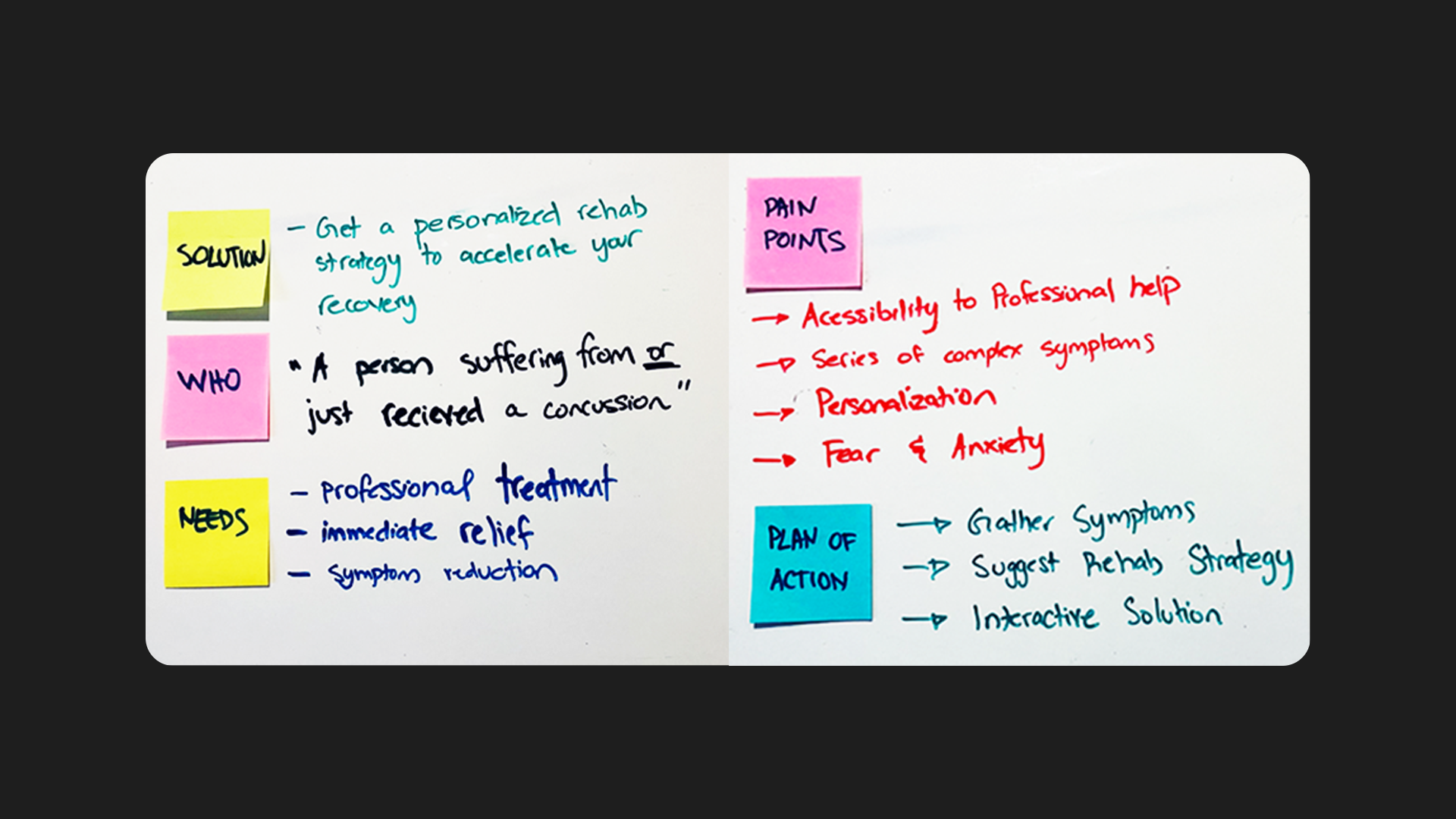
Kicking things off, a series of discussions and white-board session were conducted with the founder to get an idea of the app’s direction and requirements.
Developing our persona
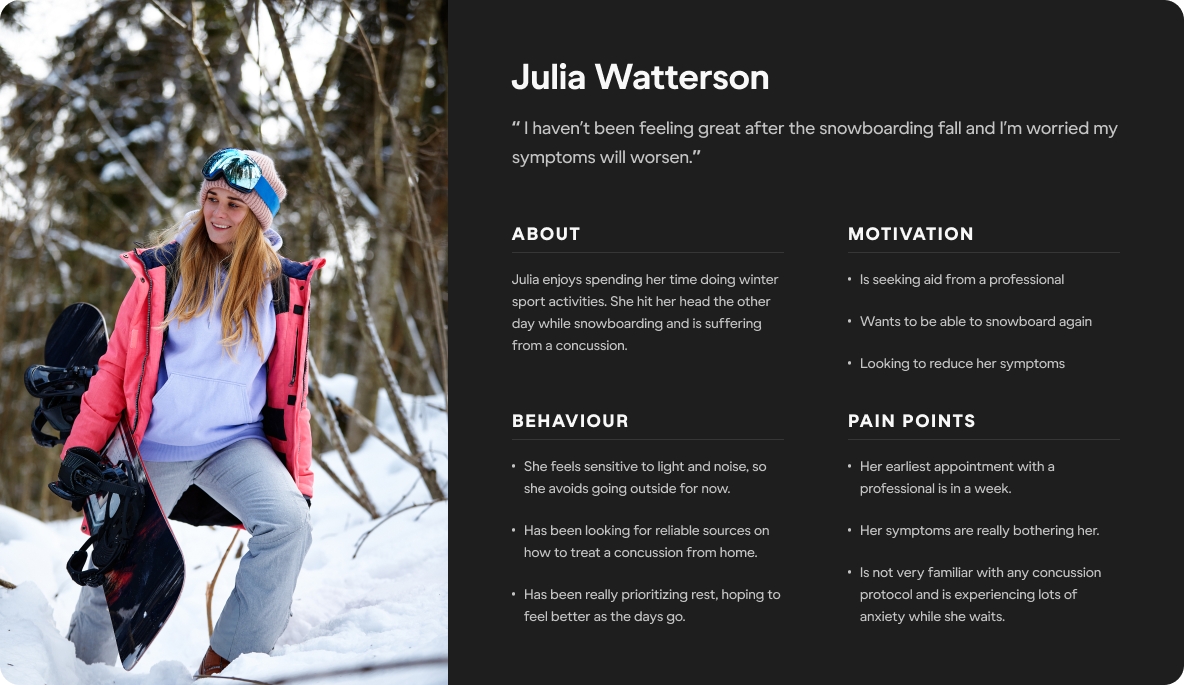
Based on our discussions with Rhea's founder, who is a lead expert in concussion treatment, I was able to put together a persona.
DEFINE
Honing in on features and functionality
Defining the user journey
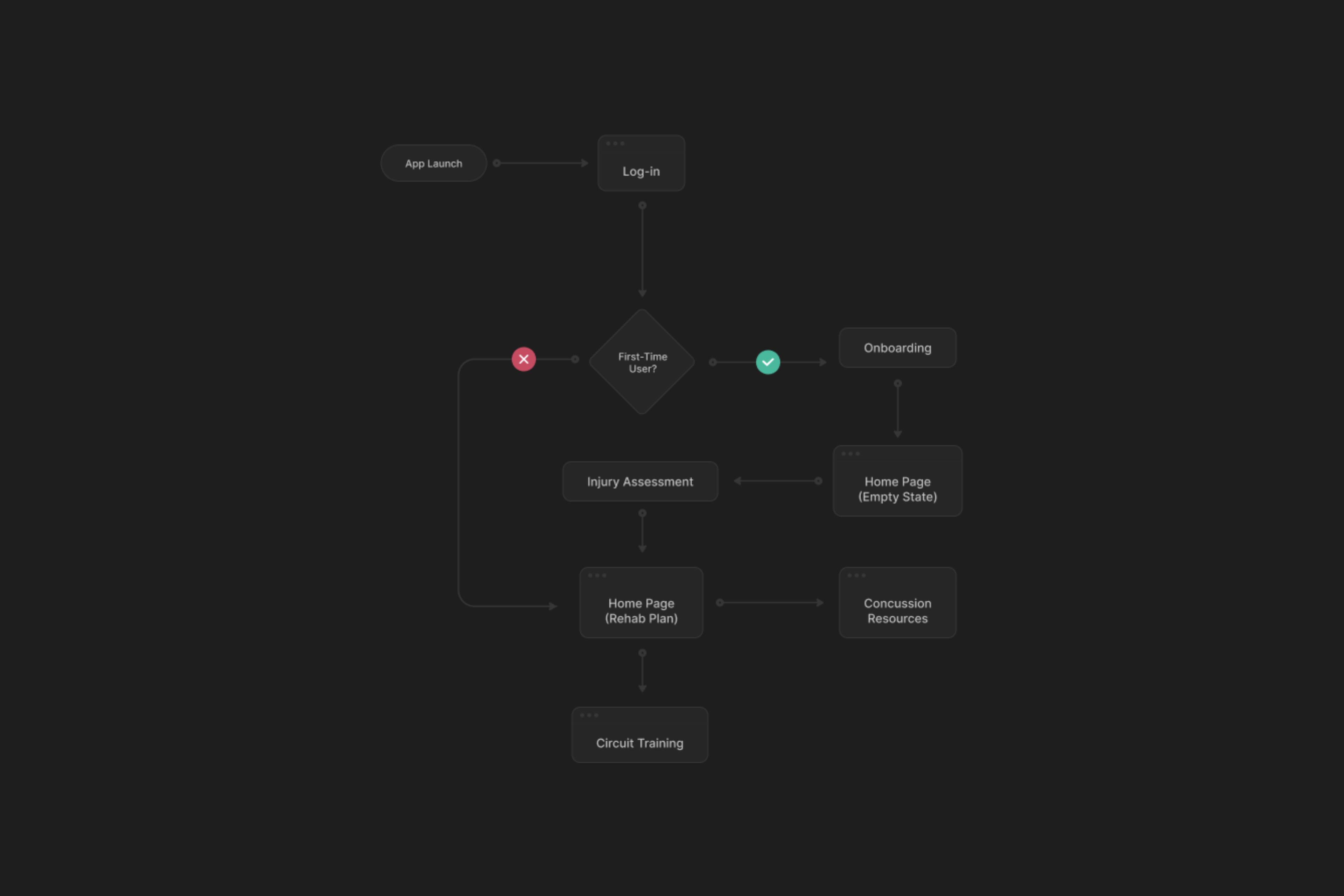
After identifying a persona, I shifted my focus to how users would interact with the app. This allowed me to develop an initial guideline for the subsequent design.
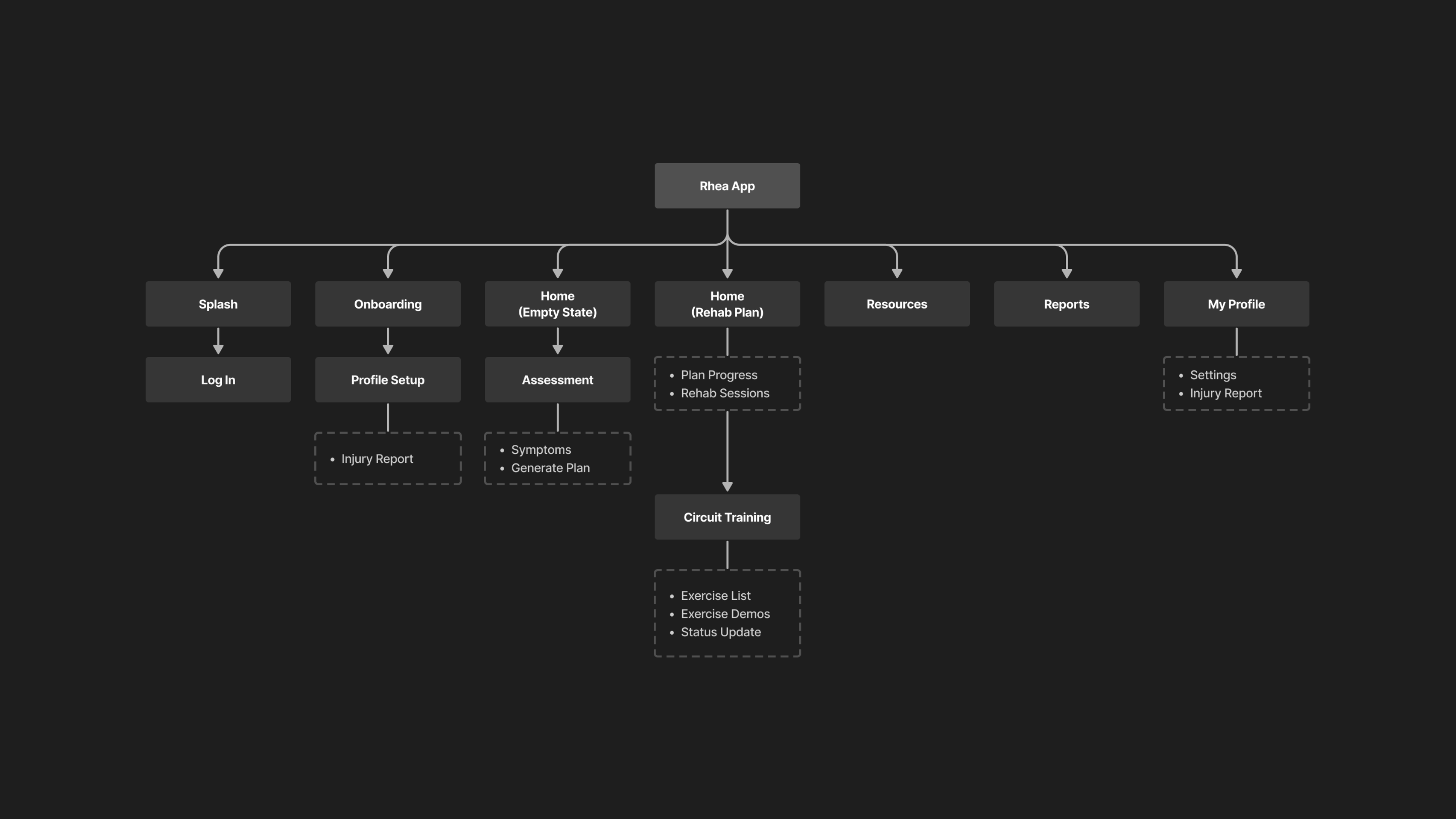
Mapping the information architecture
I organized the app's features and functionality into a clear, intuitive structure, enabling users to easily input symptoms access personalized exercise plans and monitor progress.
IDEATION
Beginning the visual design process of our app
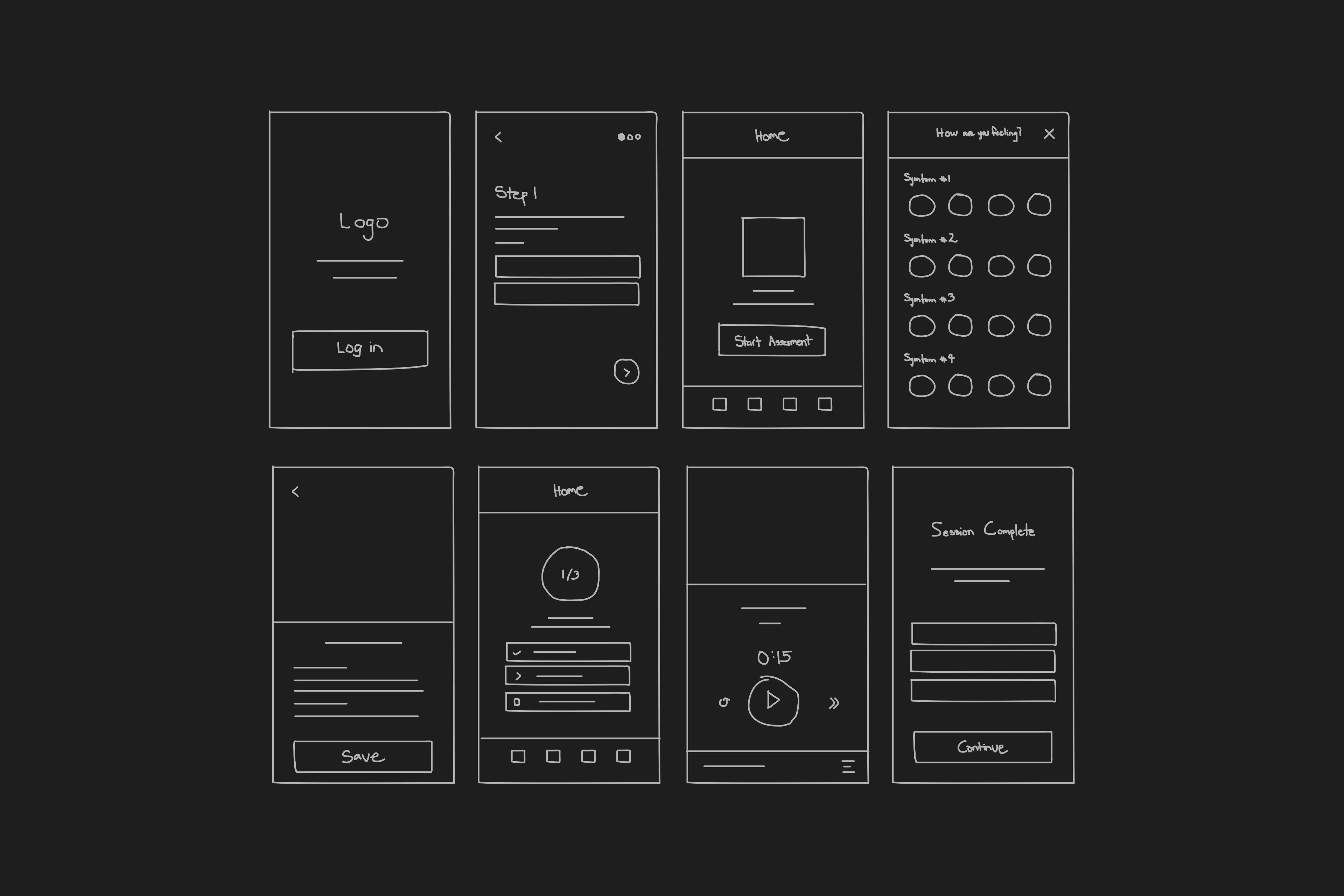
Preliminary Sketching
The visual design began to take form by sketching the core features. This helped visualize and communicate my ideas to the client.
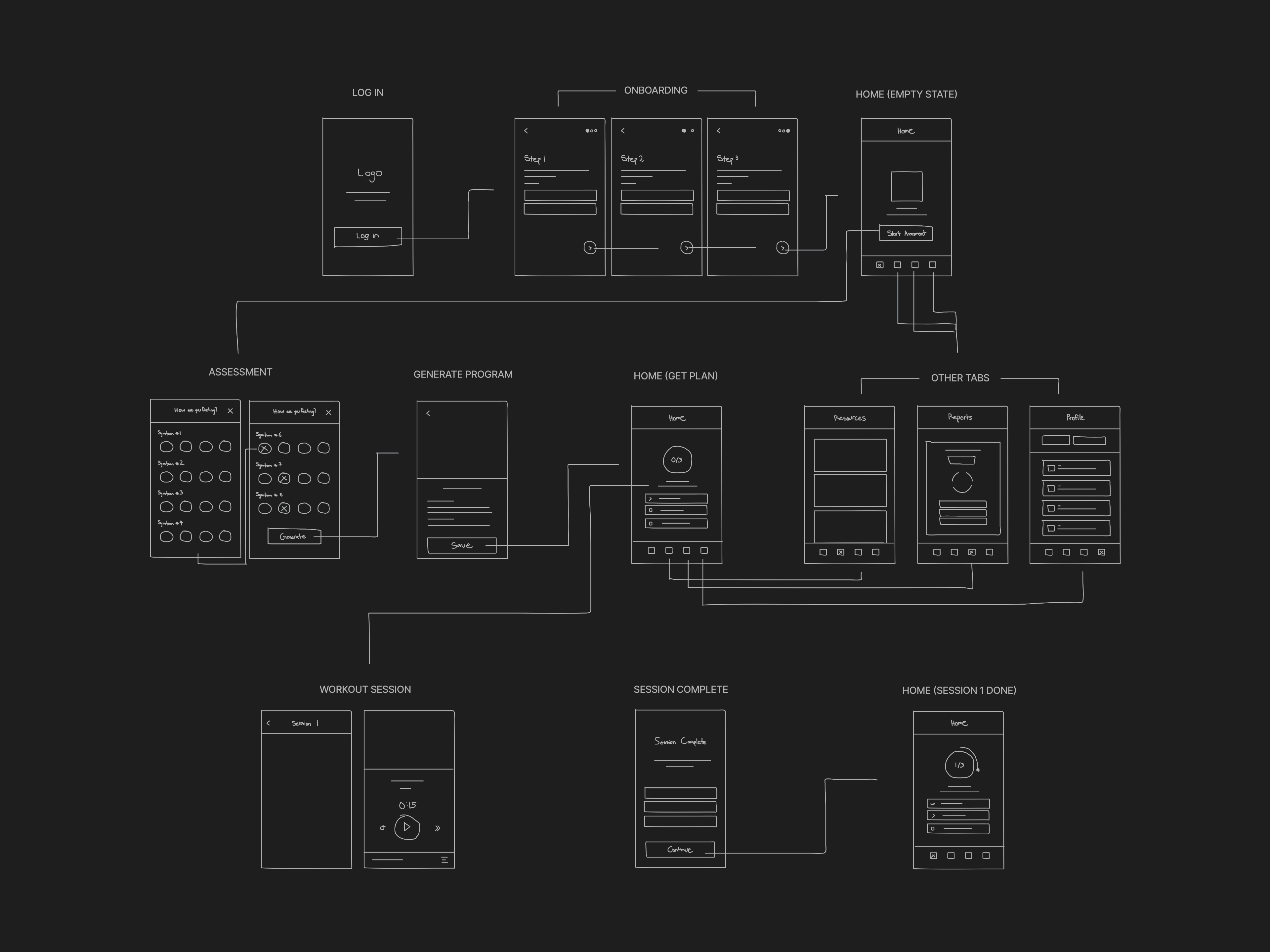
Finalizing the wireflows
Before jumping to digital wireframes, I reviewed and finalized the wireflows to ensure users were able to navigate and experience the core features of the app.
DESIGN
Crafting and testing a prototype with clinical patients
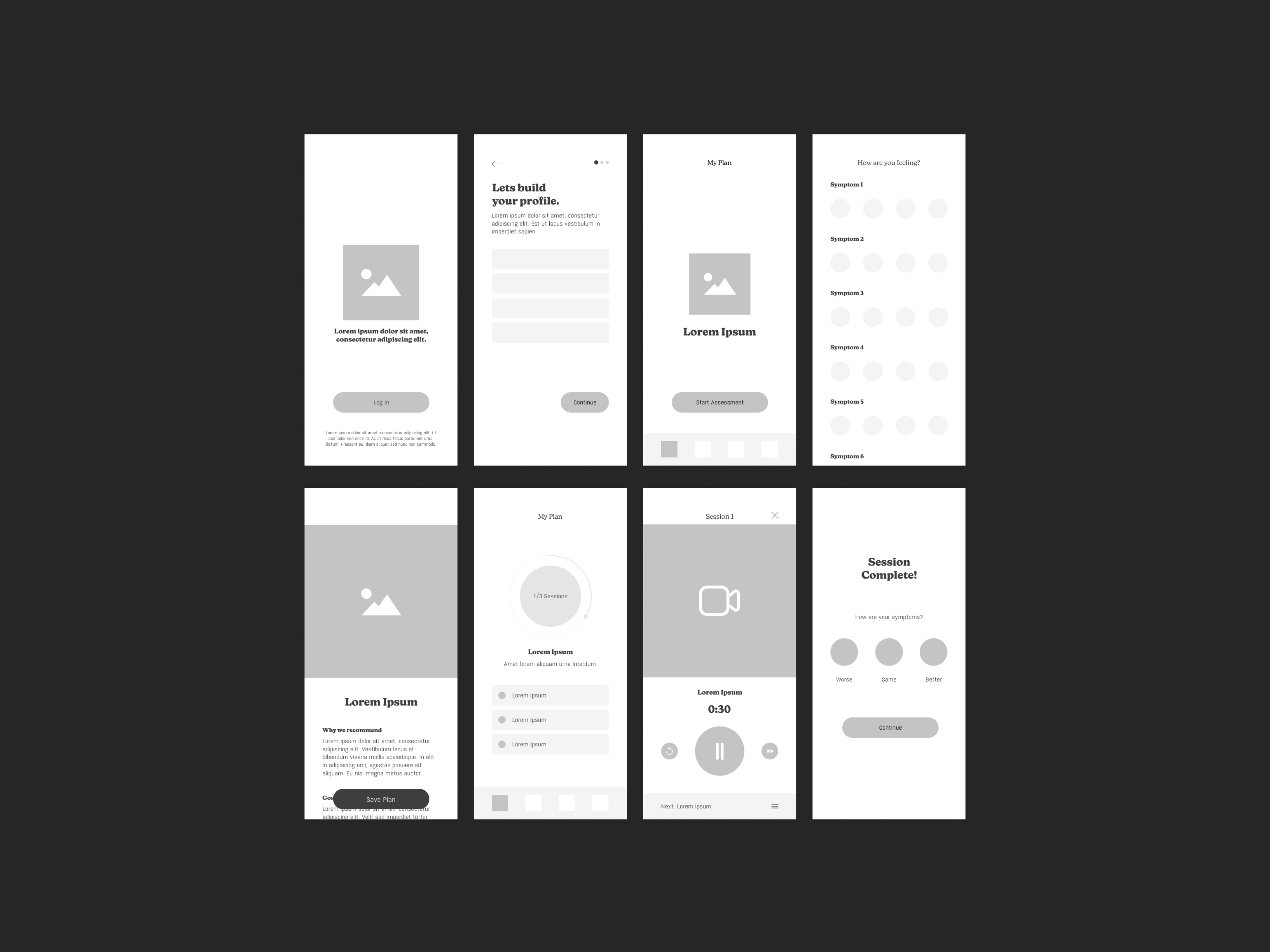
Low-fidelity wireframes
After finalizing the wireflows with my client, I moved onto transforming them into low-fidelity wireframes.
High-Fidelity Prototype
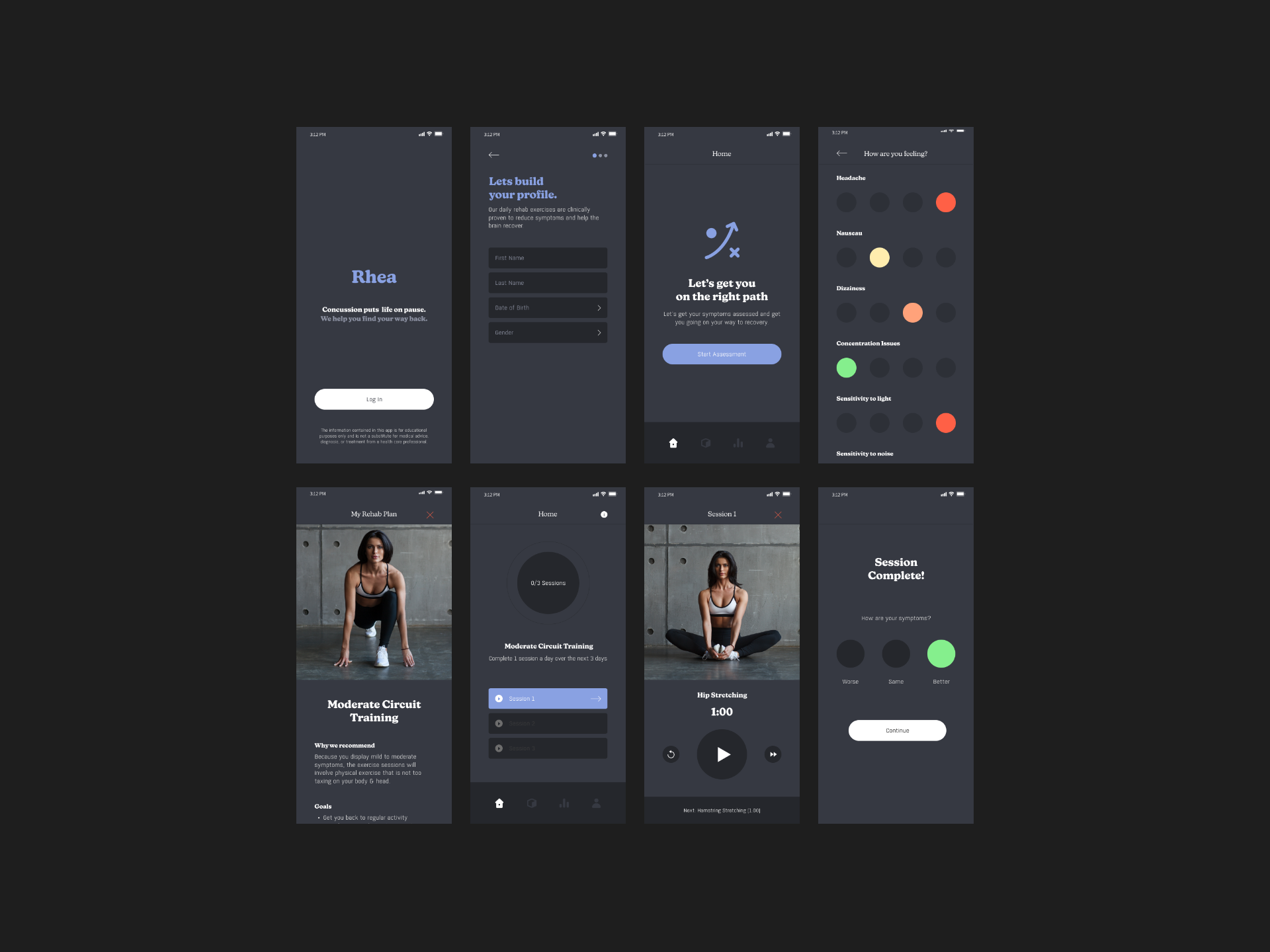
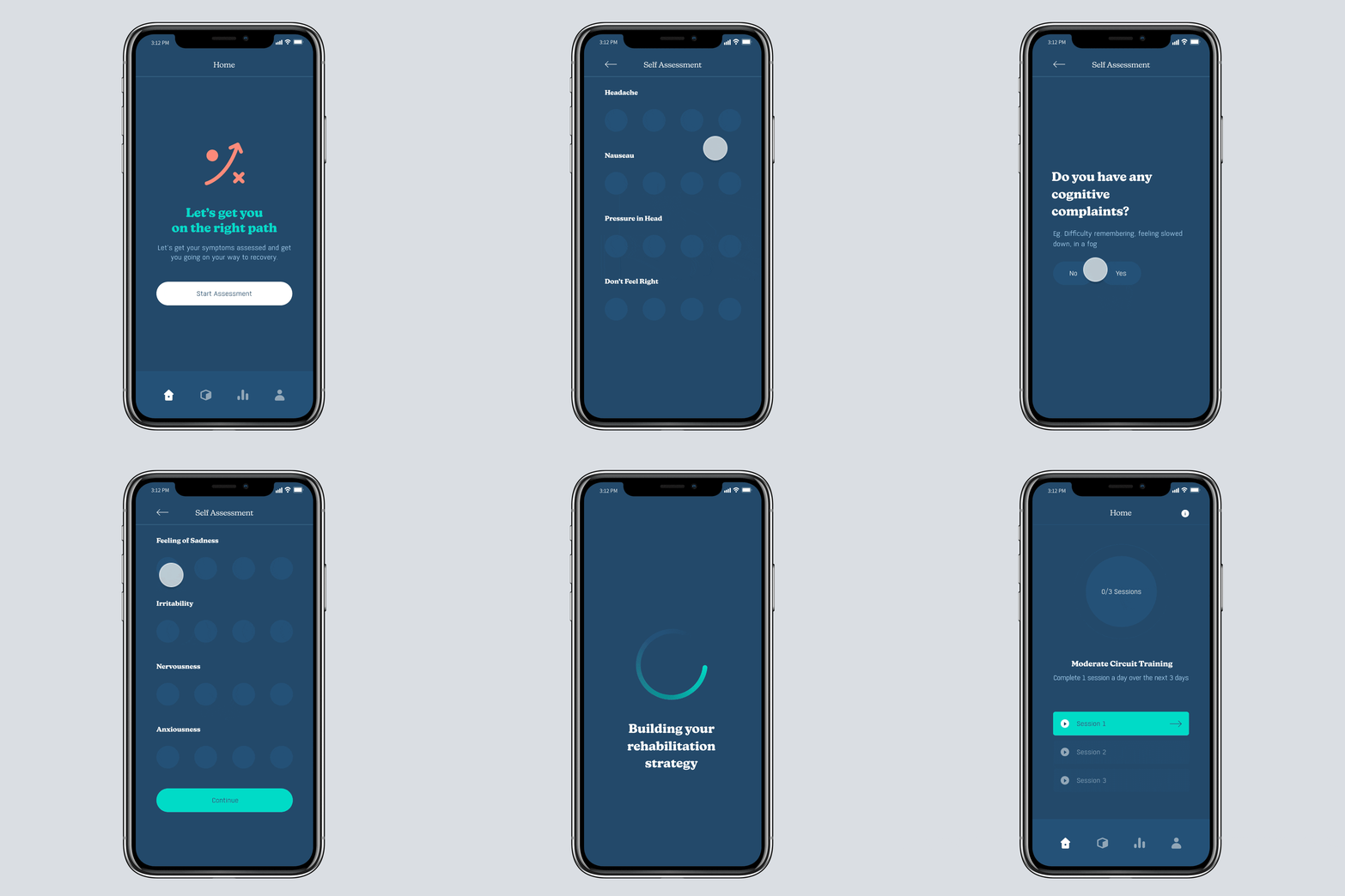
To emulate the real thing when being tested, I created a high-fidelity prototype. Since the branding was not yet finalized, I opted to go with a dark-themed interface.
Usability testing within our clinic
Referring to the protoype, our team developed a MVP version of the app. A total of 20 volunteers (most of them being previously concussed) were tasked with testing the phone application.
Our main goals for testing are:


Issue #1: Inputting Symptoms
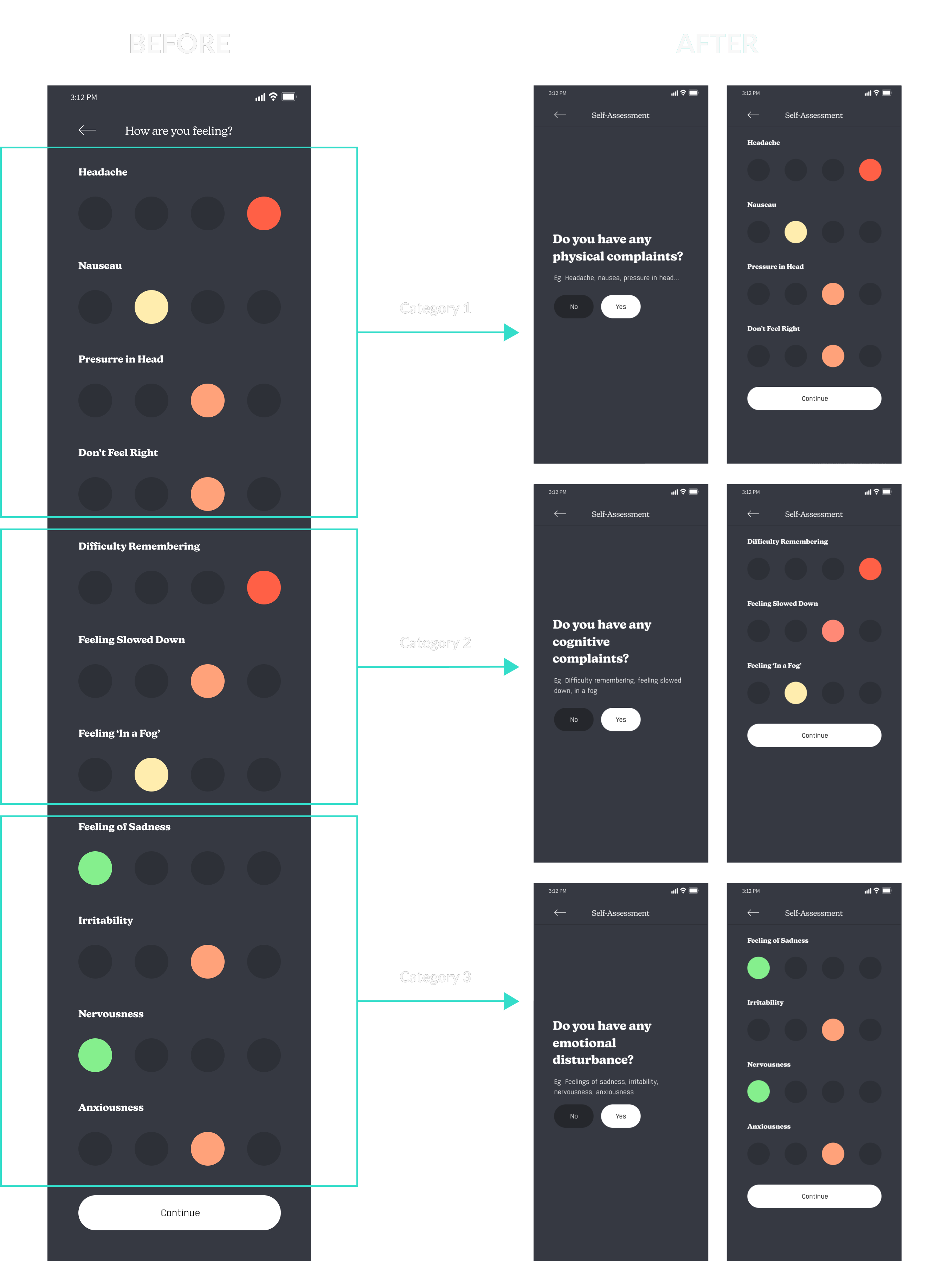
Initially, users assessed their symptoms through one, long scrolling page. Because there were so many symptoms to select from, particpants found one page too overwhelming.
Solution: I re-designed the experience by asking preliminary questions pertaining to specific symptoms. This determined whether or not to display a subsequent list of categorized symptoms.
Issue #2: Distance
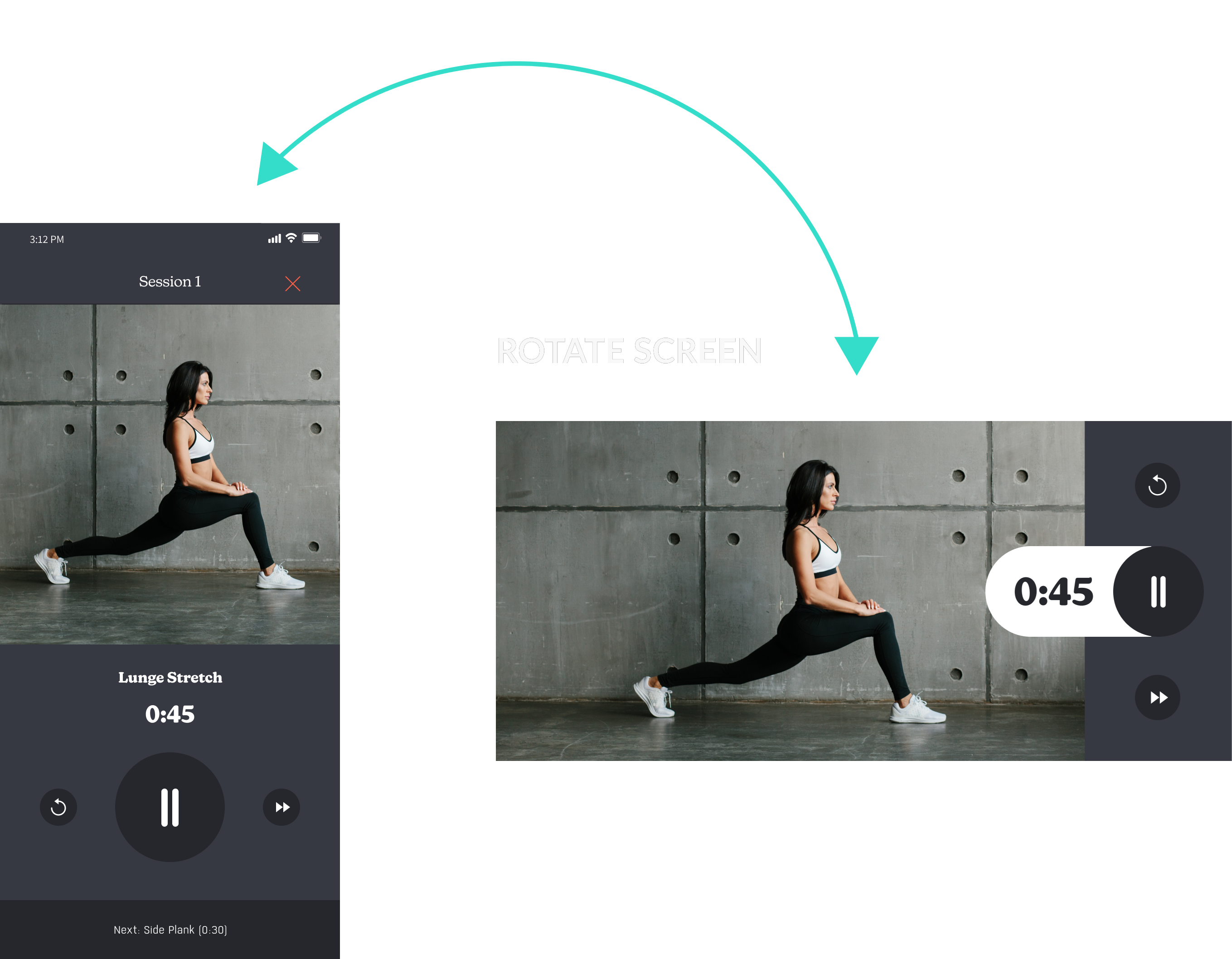
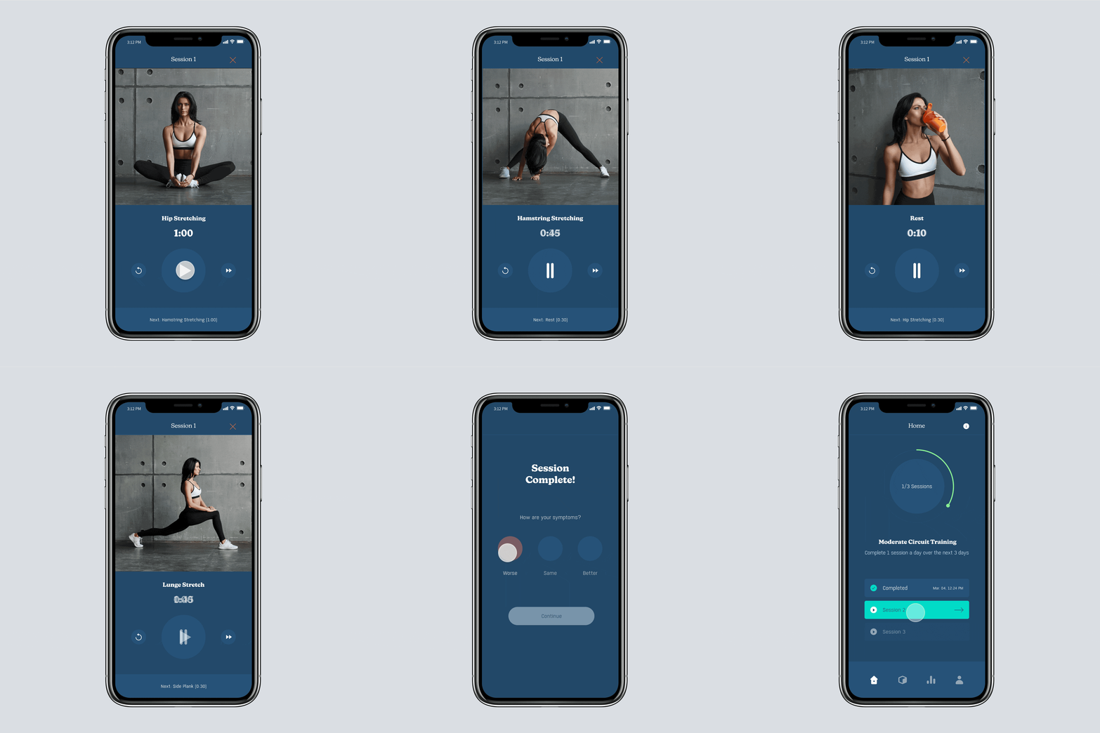
When following the circuit training, participants were having a hard time following the exercises when the phone was placed from a further distance.
Solution: I created a landscape-mode design of the circuit training section. This improved the participants ability to follow the sessions from afar.
LAUNCH
Challenging the traditional approach to treating concussions
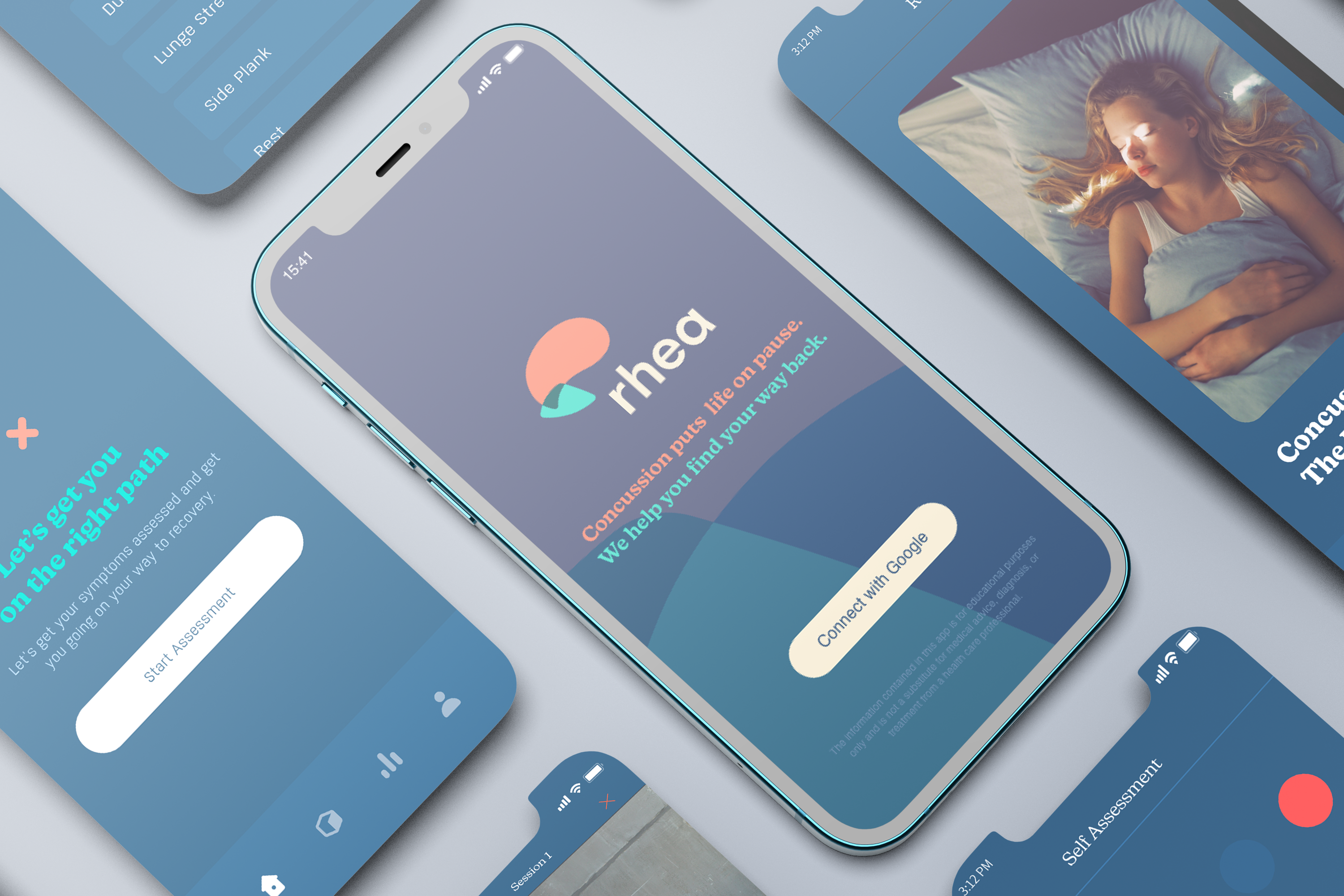
Rhea Mobile App
A rehabilitation platform that’s grounded in science and uses prescribed physical exercises to heal and care for the brain.
A tailored strategy to rehabilitation
Once we build a picture of your symptoms, you’ll receive a tailored rehabilitation strategy with daily exercises just for you.
Interactive Daily Exercises
Each exercise comes with an interactive video, so you can manage your own treatment plan and always know what to do next.
Track your progress
Recovering from concussion isn’t a linear progress. We monitor your symptoms and wearable data between key milestones and automatically adjust your rehabilitation depending on your progress.
REFLECTION
The lessons learned from this project
Prepare readily for interviews.
This project made me aware of the amount of preparation and effort user interviews require. From having the tasks and questions ready to observing the participants and analyzing the data – this part of the design process is definitely something not to be underestimated.
Designing with a system.
When building the high-fidelity prototype, I focused on sticking with a design system. This helped me keep consistency across all screens, design more efficiently and reduce the risk of creating potential confusion within the app.
Client communication is key.
This project was a great experience for me on how to stay on the same page with the client and their stakeholders . There were times where I had to push-back on specific requests. This is where I had to make sure to communicate properly the importance of sticking to the agreed upon scope and timeline of the project.